Being color blind can be a big challenge for any photographer, but it doesn’t have to limit your creative potential. While there are some unique obstacles, anyone can use their color blindness to their advantage while capturing amazing photos. In this article, we will discuss strategies and techniques that can help you maximize your creative potential as a color blind photographer.
We will help you understand that you are not alone and there are solutions. Here is what to expect.
- Definition of color blindness
- Embracing your color blindness as a unique perspective
- Examples of successful color-blind photographers
- Techniques for maximizing your creative potential as a color-blind photographer
- Color-blind friendly automated photo editing software
Definition of color blindness
Color blindness is the inability to distinguish certain colors, usually those that contain red or green. It affects an estimated 8% of males and 0.5% of females worldwide. For many people, color blindness is not a major impediment. However, for some people, like photographers, it can be a serious challenge.
A color blind photographer must rely on other aspects of photography, such as composition and light, to capture their subjects in beautiful ways. Achieving artistic success without relying on true color can be difficult, but rewarding when achieved. Ultimately, it encourages photographers to focus more on the elements that are unaffected by their inability to fully perceive color.

Embracing your color blindness as a unique perspective
As a color blind photographer, you may feel that your limited ability to accurately identify colors hinders your art. However, the truth is that embracing your color blindness can open up a unique perspective that allows you to capture images and create art in ways standard sighted photographers cannot.
Rather than feeling restricted by color blindness, embrace it as an opportunity to expand your creativity and challenge yourself artistically. Use tones, textures and shapes to compose creative visual stories that are all your own.
The world of photography has no limits. If anything, those willing to experiment and try something new will find greater success in the competitive field. So take advantage of this opportunity and explore the possibilities of creating beautiful photos without relying on traditional notions of color composition!
Examples of successful color blind photographers
While color blindness does not affect most of the world’s population, the number of people with some form of color deficiency is still staggering. Some color-blind photographers have developed successful careers in the industry. Here are some examples of photographers who have found success despite their vision challenges:
Cameron Bushong is a portrait photographer who has built a fantastic portfolio of work over the years. When looking at his photographs, you will likely notice the desaturated style that contains more greens than other tones.
David Wilder is a color-blind landscape photographer with deuteranopia, which means his eyes don’t detect enough green tones. But looking at his work, you will notice many beautiful greens.
Nathan Elson is a commercial, fashion, and corporate portrait photographer who is color-deficient. Nathan says one big benefit of having his color deficiency is that his work has been highly consistent. Additionally, his entire production team knows he cannot see color perfectly, so he relies on them to ensure that clients get the best results.
In the video below, Nathan says, “I want people to know that no matter who you are, there are hurdles that all of us have to get over.”
https://www.youtube.com/watch?v=C-wp9IJ2GEk
Joel Grimes is also a color blind photographer, who does not see green. Joel remembers starting out in high school, going from black and white to color, and his first print was so off his teacher knew immediately he was color blind. His teacher told him to never let his color blindness stop him from chasing his dream. To this day, Joel is teaching thousands of photographers through his courses and workshops. Joel’s editing style has desaturated colors, as that’s how he sees the world around him.
For Joel to visually see greens in his photos, he has to take certain steps that help. He over-saturates his greens way more than what they would need to be in an edit. That way he can see a change in contrast where greens would be. From there he can make any adjustments he wants using the colors he can see. Of course, he’d bring the saturation back down before delivering a final product.
Brian Matiash cannot see the color red. I have known Brian for a long time, but years ago he and I were photographing around New York City, and I told him to look at the person in a red shirt. He didn’t know who I was talking about. It was at that point that I learned that he and I had color blindness in common. Looking at Brian’s work, you will notice very little red. Interesting, right?
Then there is me, Scott Wyden Kivowitz. Like my father and grandfather, I am color blind. But like Nathan Elson, more color deficient. Mine is interesting, and one that I inherited, as previously mentioned. I see all colors, but not vividly, and when two similar colors are next to each other, I cannot tell the difference. That has not stopped me from doing work for clients, and running a successful photography business.

Techniques for maximizing your creative potential as a color blind photographer
One of the best ways to optimize your creativity as a color blind photographer is by focusing on shapes and form. By concentrating on elements such as unique lines, curves, shadows, and other aspects of composition, you can create stunning images that don’t rely heavily on differentiating between hues. Contrasting tones help emphasize certain elements in a photo, which can make your image more dynamic even without relying on color differentiation.
But there are additional things you can do and utilize to maximize your potential.
Calibrate your screen
I personally use a ColorMunki to calibrate my screens. I do it at least once a month to ensure that no matter what is displayed is accurate, whether it’s me looking at it or someone else. Tools like this are easy to use. You install the software, plug in the device, hang it in front of your screen, and let the device auto-calibrate color and contrast for you.
White balance in camera
There are so many products available for white balance in cameras. But my favorite is the ColorChecker Passport. I love it because of the integrated software with Lightroom Classic. Right from my Lightroom Catalog, I can have a RAW photo sent to the ColorChecker software, and then white balance perfectly to what is on the color card. That means perfect skin tones every time, even if I cannot tell if they are perfect with my own eyes.
Phone a friend
This might be one of the more obvious solutions, and it’s okay to do it. I ask my wife all the time if my colors are accurate. When I was in college, I asked my professor for help. Asking for help is okay! So do it if you need to.
RAW, but black and white
You heard earlier that Nathan would edit in black and white until he’s happy, before switching back to color. The same can be done in camera, as long as your camera is set to RAW mode.
When photographing in RAW, you can set your picture display to black and white. Then every preview you have will be without color, so you can focus on shapes, shadows, contrast, and composition, not color. The beauty here is that when you bring the photos into Lightroom Classic, they will still look black and white, but you can switch back to color when ready.
* This will not work if your camera is set to JPEG

Color blind-friendly photo editing software
The last item here is software that can help ensure accurate color and white balance. For color blind photographers, editing photos in bulk can be difficult, and can be the one thing most dreaded. Because so much of the photo editing software is not designed to accommodate the unique needs of those with color blindness. But, thanks to innovations in technology, this is no longer an issue.
Imagen is color-blind-friendly photo editing software, which allows photographers to no longer worry about inaccuracy. The software is designed to learn how you edit in Lightroom Classic. It creates an AI Profile to edit all your new photos. If you do not have an editing style that is consistent and accurate enough with its white balance, then there is a solution included.
Imagen also offers Talent AI Profiles. These are pre-built AI Profiles built on thousands of edits from some of the best photographers in the world.
You can use these instantly on our photos and save countless frustrating hours behind the computer adjusting Lightroom parameters or applying different presets. Including some colors which might be difficult for you to see. Love & Light from Sarah Edmunds and Clean & Crisp from Susan Stripling, which are the two most natural editing styles with true-to-life color tweaks.
“My style is very neutral, with little to no creative distortion of color. It’s easy-to-use as a base, or if you want to get creative, you can just add your own adjustments on-top and batch sync. My focus is on good white balance, exposure and subtle hue adjustments to give photos some vibrancy while maintaining good skin tones.” – Sarah Edmunds
Conclusion
Being a color blind photographer does not mean you are limited in your creativity. With the right tools and techniques, you can make stunning images that are as captivating as any other photograph. As a color blind photographer, you have access to a unique perspective that allows you to see the world differently than most. This is an incredible advantage that can help you create some truly remarkable photographs.
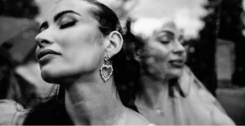
Cover photo by Fer Juaristi. Check out his Talent AI Profile, Tierra