

How to Design a Wedding Album: A Step-by-Step Guide (2026)
Table of contents
- Key Takeaways
- Prerequisites: Workspace Calibration and Color Settings
- Selecting the Best Aspect Ratios and Canvas Sizes
- The Psychology of Rapid Image Culling
- Color Consistency and Intelligent Grading
- Comparing Professional Album Design Software
- Layout Geometry: Mastering Negative Space and Grids
- Technical Margins: Managing Bleeds, Trim Lines, and Gutters
- Managing Client Feedback and Smart Revision Policies
- Exporting Formats and Final Print Verification
- Troubleshooting Common Print and Layout Discrepancies
- Financial Strategy: Pricing Your Albums for Profit
- Frequently Asked Questions
- What is the most popular wedding album size in 2026?
- Should I offer leather or linen covers to my clients?
- How many photos should I include on a single spread?
- What is the difference between layflat and standard binding?
- How much should I charge clients for a custom wedding album?
- Can I design a wedding album in Lightroom?
- What color profile should I use for album design exports?
- Is it better to design chronologically or by theme?
- Keep exploring
Designing a wedding album doesn’t have to drain your business profits or eat up your evenings. Plenty of working photographers still lose whole nights to a folder of RAW files, unsure where to even start the layout.
Want to speed things up? Explore Imagen’s new Studio, where you cull, edit and export in one project. Exploring is free, and you pay on export.
You don’t have to sacrifice your own sanity to produce beautiful physical keepsakes, either. Here’s exactly how to build a genuinely profitable workflow that delivers polished album designs to your clients in 2026.
Key Takeaways
- Wedding albums still matter to couples: 28% of couples say a high-quality physical keepsake is a top priority.
- Keep design stress low by sticking to the industry-standard 20 to 40 spreads, built from 70 to 120 curated images.
- An sRGB color profile isn’t optional. Skip it and you risk a rough 15-20% color shift once the album prints.
- AI-driven editing tools can cut your post-production time by up to 90%, changing how fast you can prep your visual assets.
- Keep your layouts clean with 0.125 to 0.25-inch bleed margins so faces and key details don’t get chopped off during trimming.
Prerequisites: Workspace Calibration and Color Settings
Getting your technical workspace right is the real foundation of album design. If your monitor calibration is off, or you’re working in the wrong color space, your printed album won’t look anything like what you saw on screen.
You really don’t want to explain to a heartbroken couple why their wedding whites look green instead of clean white. So here’s a checklist of exactly what you need to prepare before you start placing images on a canvas:
- Calibrated Monitor - Run a hardware colorimeter and calibrate your screen to a brightness of 120 cd/m2 and a white point of 6500K.
- Color Profiles - Set your editing software and layout tool to sRGB or Adobe RGB (1998) color spaces. 98% of professional labs require one of the two.
- High-Resolution Files - Verify all selected photos are exported at a minimum of 300 DPI at their final print dimensions to prevent ugly pixelation.
- Lab Specs - Download the exact layout templates or ICC color profiles from your chosen print lab to match their output machines.
- Stable Internet - You’ll need a reliable connection to upload high-resolution multi-gigabyte layout files to cloud proofing systems or print labs.
Don’t skip these steps. Preparing your files correctly at the start genuinely saves you from expensive reprints down the line. Once your system is calibrated and your files are ready, you can move on to the actual layout.
Selecting the Best Aspect Ratios and Canvas Sizes
Picking the right canvas size is the first major decision you’ll make. It affects how your photos sit on the page and shapes the entire layout flow. Standard square formats are the most forgiving option for a mix of portrait and landscape orientations.
Choosing the wrong size can genuinely wreck your composition options. Pick a vertical album, and landscape group shots shrink down to nothing. Pick a horizontal one, and vertical portraits become hard to place. Here’s how the typical dimensions compare:
- The 10x10 Square - This is the gold standard because it handles vertical and horizontal shots equally well. It’s the most balanced option for almost any layout.
- The 12x12 Large Square - Perfect for high-end luxury albums. It offers a massive canvas, but it’s heavier and more expensive to ship.
- The 9x12 Horizontal - Best for wide landscape shots and environmental portraits. It doesn’t handle vertical detail shots well unless you group them side-by-side.
- The 8x10 Vertical - Great for parent albums or smaller budget packages, but it severely limits your layout options for ceremony group shots.
Steer your client toward a square layout first. It simplifies your design templates and speeds up your whole workflow. Plus, square albums sit beautifully on standard coffee tables and bookshelves.
The Psychology of Rapid Image Culling
Culling isn’t just about tossing blurry photos. It’s about finding the emotional heartbeat of the wedding day without getting lost in nostalgia. Spend too much time on each photo and you’ll burn out fast.
Studies show that 65% of photographers report culling takes 2 to 4 hours per wedding, a massive drain on your hourly rate. Treat culling like an assembly line: move fast and trust your gut. Here’s a structured approach that speeds up photo selection:
- The First Pass - Run through the entire catalog in Lightroom, flagging only the absolute must-have moments like the first kiss and family portraits.
- The Second Pass - Filter for candid emotions, laughter, and high-energy dance floor moments that tell the true story of the party.
- The Detail Sweep - Pick five to ten shots of the rings, flowers, table settings, and venue to help transition between different parts of the day.
- The Final Reduction - Look at your total selected count. If it’s over 120 images, aggressively cut duplicate expressions until you’ve reached your target.
Remember, your final target is 70 to 120 images. Anything more will make the pages look cluttered. Keep your selections tight and you’ll find the rest of the design process runs smoothly. If you’re still drowning in RAW files, an AI photo culling tool can automatically find your sharpest images, catch closed eyes, and filter out near-duplicates in minutes.
Color Consistency and Intelligent Grading
Your layouts will look messy if the colors swing wildly from page to page. Indoor reception lighting runs notoriously warm, while outdoor ceremonies tend to skew cool and blue. Match these tones before you start designing.
Thankfully, you don’t have to nudge sliders manually for hours anymore. Using Imagen for your post-production lets you apply consistent edits across your entire catalog in seconds. The software studies your past edits and applies a matching style to your new images, which keeps the color story consistent from spread to spread. When you are ready to build your layouts, you can export finished JPG, TIFF or PNG files straight from Imagen or send edits back to Lightroom Classic.
Look at the numbers: AI photo editing reduces post-production time by up to 90%, so you can have edited photos ready for layout design almost instantly. That keeps your momentum going while the wedding is still fresh in your mind. Here’s why automated editing profiles save your sanity:
- Smart Profile Training - You can build personalized AI profiles that study your personal editing history to replicate your exact signature look.
- Exposure Correction - The AI automatically balances exposure disparities across mixed lighting environments so pages look unified.
- Time Conservation - Instead of spending three days on color corrections, you’ll finish the entire catalog in under ten minutes.
Pro Tip: Create a dedicated Lightroom collection for your selected album photos. Run a final color-matching pass to make sure white balance stays identical across adjacent images on the same spread. That prevents jarring color jumps when the book is open.
Comparing Professional Album Design Software
You’ve got tons of software options for designing an album. Some are wildly fast and automated. Others hand you total manual control over every single pixel. So which one’s right for you? That really depends on your business volume.
Let’s compare the leading design platforms in the industry today. This will help you figure out which tool fits your budget and your style:
| Software Tool | Pricing Model | Design Speed | Primary Advantage |
|---|---|---|---|
| Pixellu SmartAlbums | $16/month (billed annually) or $299 one-time | Ultra Fast | Smart drag-and-drop templates that automatically adjust gaps and margins. |
| Fundy Designer v11 | $29/month subscription or $499 one-time | Fast | Excellent integrated sales tools and advanced custom design flexibility. |
| Adobe InDesign | $22.99/month (Creative Cloud) | Slow | Absolute creative control over typography, custom grids, and vector elements. |
| Canva Pro | $15/month | Medium | Simple web-based editor, but lacks advanced color profiles and professional print templates. |
Designing more than 10 albums a year? Dedicated tools like SmartAlbums or Fundy are worth every penny. They’ll save you dozens of hours of manual resizing. If you’re only doing occasional designs, manual tools like InDesign work just fine, though they come with a much steeper learning curve.
Layout Geometry: Mastering Negative Space and Grids
The most common mistake amateur designers make is cramming too many photos onto a single page. It makes the whole album look chaotic and cheap. Want that high-end, luxury feel? You’ve got to embrace negative space.
Negative space isn’t wasted space. It’s visual breathing room that guides the viewer’s eyes to what matters most. Think of your album like a high-end fashion magazine, and follow these strict layout geometry rules to keep your designs looking clean:
- The One-Hero Rule - Every spread should have one dominant image that’s at least twice as large as any other photo on that page.
- Consistent Gaps - Keep the spacing between your images (the white gutters) completely uniform across the entire album. A standard gap of 0.15 to 0.25 inches works best.
- Solid Backgrounds - Avoid distracting background textures or low-opacity photo overlays. Stick to solid white, charcoal, or light gray backgrounds.
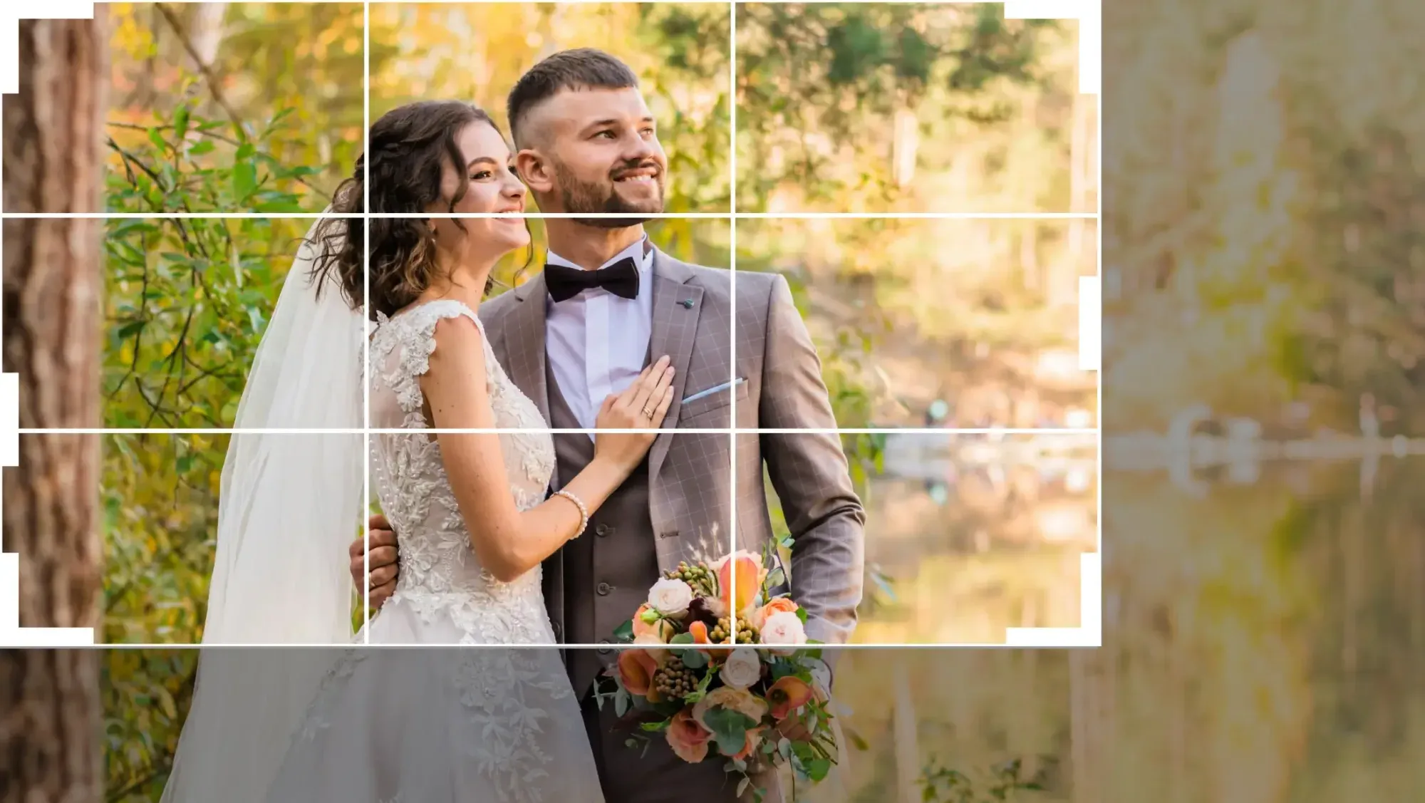
- The Rule of Thirds - Place your main subjects along imaginary grid lines to create a dynamic sense of balance and movement across the spread.
Don’t be afraid of empty pages, either. A single, beautiful portrait sitting on a blank white page carries a massive emotional impact. It tells the viewer that this specific moment matters, and matters a lot.
Technical Margins: Managing Bleeds, Trim Lines, and Gutters
If you don’t understand the technical specs of printing, your designs will look terrible when they come back from the lab. Here’s why: pages are printed on large sheets and then trimmed down to size by heavy industrial blades. That process is never 100% precise.
That’s exactly why you need to set your bleed margins correctly. Skip this, and key details near the edges of your photos might get chopped off in trimming. Here’s how to set up your document margins, step by step:
- Set the Bleed - Add a standard 0.125 to 0.25-inch bleed margin to the outer edges of your layout document.
- Define the Safe Zone - Keep all critical elements (like text, faces, and hands) at least 0.5 inches away from the final trim line.
- Protect the Gutter - The center fold of the album’s where the pages bind together. Keep faces and text at least 0.75 inches away from this center crease to avoid distortion.
- Verify Panoramic Spreads - Designing a layflat album? You can run a single photo across the center gutter, just make sure no faces sit directly on the crease.
Honestly, getting these technical details right is the difference between a successful print run and an expensive reprint. Always grab the exact layout templates your print lab provides before you start your project.
Managing Client Feedback and Smart Revision Policies
You’ve poured your heart into a beautiful design. You send it off to your clients, and they come back with a list of 50 photo swaps and layout tweaks. Just like that, your profitable design project turns into an endless cycle of revisions.
But you can dodge all this by setting clear, easy-to-see boundaries and managing expectations from day one. In 2026, 42% of modern couples prefer reviewing their album proofs on a mobile device over a desktop computer. That means your proofing system has to be fast, clear, and dead simple to use. Here’s how to structure your revision policy so you protect your time:
- Set a Hard Deadline - Give your clients a strict 14-day window to review their proofs. If they don’t respond, their album goes to the back of your production queue.
- Limit the Rounds of Revisions - Include exactly two rounds of revisions in your base design package. Charge $75 per round for anything after that.
- Consolidate the Feedback - Make sure the couple submits all their requested changes at once through a dedicated online proofing portal like AlbumPrf.
- Educate on Selection Limits - Remind them that adding more photos means adding more pages, and that raises their final print cost.
Enforce these rules and you’ll notice clients make decisions a lot faster. It keeps the project moving forward and gets that physical album into their hands while they’re still buzzing about their wedding memories.
Exporting Formats and Final Print Verification
The layout is approved and your client is thrilled. Now comes the technical phase: preparing your files for the printing press. This is exactly where many photographers make critical errors that cause color shifts and blurriness.
Make sure your final exports match the lab’s color profile requirements. Most professional labs require files in the sRGB color space, which is the industry standard for digital and photographic print processes. Export in ProPhoto RGB instead, and you will likely see a massive 15-20% shift in color saturation once the physical pages are printed.
“The secret to a flawless layout isn’t the software you use to arrange the pages; it’s the absolute visual harmony of the photos. When exposure and white balance match perfectly across lighting changes, the album tells a story instead of creating a visual distraction.”
Itamar Haim, AI Photography Workflow Specialist
Pro Tip: Always export your final pages as high-quality, uncompressed JPEGs at 300 DPI. Never use low-quality web compression settings. Doing so will introduce visible artifacts and pixelation on the printed page.
Troubleshooting Common Print and Layout Discrepancies
Even when you do everything right, you might still receive an album with a print defect or a binding issue. Learn how to handle these situations with your lab. It matters for your sanity and for protecting your profit margins.
Do not get into a shouting match with customer service. Most professional labs are genuinely accommodating when you approach them with clear evidence of a production error. Follow this exact process if an album arrives with issues:
- Document the Problem - Take clear, well-lit photos and videos of the defect, whether it’s a scratched leather cover, misaligned binding, or a color shift.
- Compare to the Original File - Open the exported JPEG of that specific spread on your calibrated monitor to verify if the issue was in your file or the print process.
- Contact Customer Support Immediately - Most labs have a strict 7 to 14-day window for reporting shipping damage or manufacturing defects.
- Request a Proof Print - If you’re dealing with a complex color discrepancy, ask the lab to send you a single physical proof print before they run the entire album again.
Stay calm and organized, and you will resolve production issues quickly while keeping your business running smoothly. Most top-tier labs will reprint the album for free if the mistake is on their end.
Financial Strategy: Pricing Your Albums for Profit
Many photographers lose money on albums simply because they never account for design time. Charge $300 for an album that costs $150 to print, spend 10 hours designing and proofing it, and you’re earning less than minimum wage.
Treat your album designs like a genuinely profitable product line, not a cheap add-on. To build a sustainable photography business, apply these pricing models and make sure you earn a healthy profit on every book you sell:
- The Three-Times Rule - Charge your clients exactly 2.5 to 3 times the physical cost of printing. If an album costs $150 to print, your retail price should start at $450.
- Hourly Design Fees - Charge a flat design fee of $150 to $200 to cover your labor, plus the physical print cost of the album.
- The All-Inclusive Package - Build the album cost into your top-tier wedding packages, making it look like a free bonus while keeping your total package price high enough to cover the expense.
- Parent Album Upsells - Offer smaller, identical duplicate copies of the main album to the couple’s parents at a 40% discount, which yields high margins with zero extra design time.
Apply these strategies and your album sales will actively support your business’s financial health. What used to be a tedious design chore becomes one of your most lucrative revenue streams. Speed up your design process enough, and your overall hourly earnings will climb fast.
What’s new in Imagen: Culling, color and export all shape a good album, and Imagen is now an intelligent, agentic Studio for professional photographers that keeps them in one place. You cull, edit, review and export in one project, in any order. Use AI culling or cull manually for free, then edit in your own style with a Personal AI Profile so the color story holds from spread to spread. The Studio is rolling out gradually as a beta.
Frequently Asked Questions
What is the most popular wedding album size in 2026?
The 10x10 inch square album remains the industry favorite. It offers a balanced layout that accommodates both vertical and horizontal photos without wasting valuable page space.
Should I offer leather or linen covers to my clients?
Offer both leather and linen covers. Linen suits modern, minimalist couples who want a light, airy feel, while leather remains the premium, durable standard for classic, luxury wedding heirlooms.
How many photos should I include on a single spread?
Aim for an average of 3 to 4 photos per spread. Some spreads should have only one dramatic hero photo, while others can feature a clean grid of 5 to 6 detail shots.
What is the difference between layflat and standard binding?
Layflat binding allows the pages to open completely flat without a visible curve in the middle. This matters for displaying panoramic, full-spread photos beautifully.
How much should I charge clients for a custom wedding album?
Most professional photographers charge 2.5 to 3 times the print cost. If an album costs $150 to print, your retail price should start around $400 to $500 to cover your time and design work.
Can I design a wedding album in Lightroom?
Yes, Lightroom Classic has a built-in Book module. However, dedicated tools like SmartAlbums or Fundy offer much faster automated layouts and better proofing features.
What color profile should I use for album design exports?
You should almost always use sRGB unless your professional print lab explicitly asks for Adobe RGB (1998) or a custom ICC color profile.
Is it better to design chronologically or by theme?
Designing chronologically is the most natural way to tell the story of the wedding day. It guides the viewer naturally from the anticipation of getting ready to the energy of the reception party.
