

7 Common Color Grading Mistakes for Event Photographers to Avoid
Table of contents
- 1. Fighting mixed venue lighting one frame at a time
- 2. Grading each image in a vacuum instead of the whole set
- 3. Wrecking skin tones with heavy saturation and the wrong hue
- 4. Crushing blacks and blowing highlights in dim rooms
- 5. Letting ceremony, reception, and video deliverables drift apart
- 6. Chasing trendy presets that do not fit the venue
- 7. Leaving grading to the last minute with no batch workflow
- How AI batch editing removes the consistency bottleneck
- A quick pre-delivery consistency check
- Frequently asked questions
The fastest way to make an event gallery look amateur is inconsistent color. When a bride’s white dress shifts from cream to blue between the ceremony and the reception, or when skin tones glow orange under tungsten uplighting, clients notice before they notice anything else. The good news is that most color grading mistakes at events come from a handful of predictable habits, and every one of them is fixable once you know what to look for.
This guide walks through the seven grading errors that show up most often in event work, from weddings and galas to corporate conferences, and explains how to avoid each one. The theme running through all of them is the same: consistency across the whole shoot matters more than any single hero frame. Get your color to hold steady from the first handshake to the last dance, and your galleries will read as polished and professional every time.
1. Fighting mixed venue lighting one frame at a time
Event venues are a nightmare of competing light sources. You will find daylight leaking through a window, warm tungsten chandeliers, cool LED uplights, and colored gels on the dance floor, sometimes all in the same room. The classic mistake is trying to neutralize each photo in isolation, chasing a “correct” white balance for every frame as if it existed on its own.
It does not. A reception hall bathed in amber light is supposed to feel warm, and cooling every shot to a clinical neutral drains the mood out of the room. Instead, decide on a target temperature for each lighting zone, then grade toward that target consistently. Pull a custom white balance off a neutral reference in each area when you can, and let the ambient warmth stay in the frame where it belongs. The aim is a believable, flattering rendition of the light that was actually there, not a lab-grade neutral that fights the atmosphere the couple paid for.
2. Grading each image in a vacuum instead of the whole set
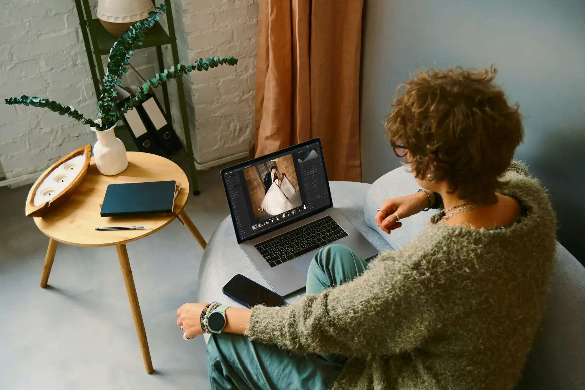
This is the biggest single error in event work, and it hides in plain sight. You open an image, make it look great, move to the next, make that one look great too, and by frame two hundred your color has drifted. Side by side in a gallery, adjacent photos of the same moment carry different casts, exposures, and contrast curves. Individually each looks fine. As a sequence, the set looks sloppy.
Event photography is a batch problem, not a single-image problem. Guests scroll galleries fast, and their eyes track continuity: the same skin tone on the same person from one photo to the next, the same white in the linens, the same feel from the getting-ready shots through the exit. The fix is to grade the set as a set. Establish your look on a reference frame, then carry that look across every image shot under similar light, correcting for exposure and white balance shifts rather than reinventing the grade each time. This is exactly the discipline that separates a coherent gallery from a patchwork one.
3. Wrecking skin tones with heavy saturation and the wrong hue
Skin is where clients look first, and it is the least forgiving part of any grade. Push global saturation too hard and everyone turns sunburned. Slide the overall temperature warm to fix a dim room and faces go orange. Get aggressive with a teal-and-orange trend and skin drifts toward a plastic, artificial cast that ages badly.
Treat skin as its own protected zone. Make your broad exposure and white balance moves first, then check faces specifically: the hue should sit in a natural range, saturation should stay restrained, and luminance should keep detail in cheeks and foreheads without going chalky. If a stylistic grade is fighting the skin, dial the grade back on the skin range rather than living with the damage. A slightly less dramatic look with believable faces will always beat a bold look that makes your subjects look ill.
4. Crushing blacks and blowing highlights in dim rooms
Receptions, galas, and evening ceremonies are dark, and the temptation is to rescue the mood with a heavy contrast curve. Crush the shadows to hide noise, lift the highlights to make the room feel brighter, and suddenly the tuxedo is a black hole and the window behind the head table is pure white.
Detail lost to clipping cannot come back. In low light, protect your tonal extremes: keep some texture in dark suits and shadowed corners, and hold the brightest highlights just below clipping so candle flames, string lights, and window glow retain shape. A gentler contrast curve with clean, controlled noise reduction reads as intentional and rich. An overcooked curve reads as a rescue job. If a room is genuinely too dark to save cleanly, that is a capture problem for next time, not something to paper over by destroying the tones you did record.
5. Letting ceremony, reception, and video deliverables drift apart
A wedding is not one shoot, it is several strung together: getting ready, ceremony, portraits, reception, send-off. Each happens in different light, and the mistake is letting each segment develop its own personality. The portraits come out airy and cool, the reception comes out moody and warm, and the gallery feels like two different photographers shot it.
Variation in light is fine and expected. What you want is a consistent grading identity underneath it, a recognizable hand that ties the segments together even as the venues change. This matters even more when the same event produces both stills and video. If a couple hires a videographer, or if you deliver highlight clips yourself, the still gallery and the moving footage should feel like they belong to the same day. Color grading in the video sense follows the same logic as stills: a shared target for skin, whites, and overall temperature so the photo set and the film do not clash when the couple views them back to back. Building that shared identity up front, before you touch individual frames, keeps the whole deliverable coherent.
6. Chasing trendy presets that do not fit the venue
A preset that looked incredible on a sun-drenched beach engagement will fall apart in a candlelit ballroom. Applying the same fashionable film emulation or moody matte look to every event, regardless of the light and the room, is a recipe for muddy shadows, sickly skin, and colors that fight the decor the couple chose so carefully.
Presets are a starting point, not a finish line. Use them to get in the neighborhood, then adjust to the actual conditions of the shoot: the venue’s color palette, the lighting, the skin tones in front of you. A grade should serve the event, not stamp your favorite trend on top of it. The most reliable event photographers develop a personal look that flexes to the room rather than a rigid filter they force onto every gallery. That personal, adaptable style is what clients recognize and rebook, and it is worth far more than any single trending preset.
7. Leaving grading to the last minute with no batch workflow
Event shoots produce thousands of frames, and clients expect fast turnaround. The mistake is treating post-production as an afterthought, then hand-grading every image the night before delivery, exhausted, making inconsistent decisions as fatigue sets in. Quality suffers, consistency suffers, and delivery slips.
The answer is a batch-first workflow that applies your look across the whole shoot up front, so you spend your time refining rather than starting from zero on every frame. Cull the set down to the keepers, establish the grade once, and let it propagate across similar lighting so your baseline is already coherent before you make any per-image tweaks. This is where the right tooling changes the economics of the entire job, and it is worth understanding how modern batch editing removes this specific bottleneck.
How AI batch editing removes the consistency bottleneck
Every mistake above shares a root cause: doing per-image work that should be per-shoot work. This is exactly the problem AI batch editing was built to solve. Imagen learns your personal editing style from your past work, builds an AI profile that reflects your choices on white balance, exposure, tone, and color, then applies that profile consistently across an entire event in the cloud. Instead of grading two thousand frames one at a time and watching your decisions drift, you get a coherent baseline across the whole gallery, with edited photos arriving in batches so you can start refining early frames while the rest finish, and AI culling available too, so you refine rather than rebuild.
For photo editing, the pricing is straightforward and pay-as-you-go: you pay for what you export, exploring the tools is free, and Imagen is a desktop app for Mac and Windows that processes your RAW files in the cloud. That turns a full wedding gallery from an overnight ordeal into a fast, consistent pass that preserves your style. For teams and events that also produce moving footage, the same consistency logic extends to video. If your work spans both stills and clips and you want that shared grading identity across deliverables, Imagen’s AI alternative to event video color grading services grades event footage clip by clip and hands off to an Assistant Editor for Premiere, with the first project free so you can test the workflow on a real event before committing.
The point is not that software grades better than you do. It is that software applies your grading decisions consistently at a scale no human can match by hand, which is precisely where events go wrong. Removing that bottleneck lets you spend your attention on the frames that deserve it instead of fighting drift across the whole set. You can see how the batch photo workflow fits your business at the Imagen homepage, including the new Studio where you cull, edit and export in one project.
A quick pre-delivery consistency check
Before any event gallery goes out, run a fast review pass built around the mistakes above. Pull up a filmstrip of the full set and scan for skin tones that jump between adjacent frames. Check that whites hold steady from ceremony to reception. Confirm no dark suits have gone to solid black and no windows have blown to solid white. Verify the segments share a common identity even though the light changed. If stills and video are both going out, view them side by side and make sure they read as the same event. This five-minute check catches the drift that individual editing hides, and it is the single most valuable habit an event photographer can build into their workflow.
What’s new in Imagen: Event galleries drift when every frame is handled on its own, and Imagen is now an intelligent, agentic Studio for professional photographers, one project where you cull, edit, review and export in any order. Your Personal AI Profile, learned from your past edits, keeps your look steady, and you can apply more than one AI Profile to a selected set of photos when a room calls for a different feel, which takes some processing time. The Studio is rolling out gradually as a beta.
Frequently asked questions
What is the most common color grading mistake at events?
Grading each image in isolation instead of as a set. Individual photos can each look good while the gallery as a whole drifts in color and exposure. The fix is to establish your look on a reference frame and carry it consistently across every image shot in similar light.
How do I keep skin tones natural in mixed venue lighting?
Set your broad white balance and exposure first, then treat skin as a protected zone. Keep the hue in a natural range, hold saturation back, and preserve luminance detail in faces. If a stylistic grade is pushing skin toward orange or plastic, reduce the grade on the skin range rather than accepting the damage.
Should photo and video from the same event match in color?
Yes. When a couple views the still gallery and a highlight film back to back, mismatched color reads as unprofessional. Set a shared target for skin, whites, and overall temperature so both deliverables share one grading identity, even though stills and footage were captured differently.
Can AI editing keep a whole event gallery consistent?
That is its core strength. AI batch editing learns your personal style, builds a profile from your past edits, and applies it across an entire shoot in the cloud, so your grading decisions stay consistent across thousands of frames instead of drifting as you tire. It handles culling too, leaving you to refine rather than start from scratch.
