

9 Color Grading Tips for Food Photographers
Table of contents
- 1. Nail white balance before you touch anything else
- 2. Grade for the ingredient, not for the trend
- 3. Use HSL to fix one color without breaking the others
- 4. Respect the warm-cool story of the dish
- 5. Watch your saturation, especially in the reds
- 6. Keep highlights clean on shiny and wet surfaces
- 7. Mind the background and the plate, not just the food
- 8. Build a look you can repeat
- 9. Let AI carry the consistency across a full shoot
- A quick pre-delivery color checklist
- Where a dedicated tool fits instead
- Frequently asked questions
Good color grading is what makes food look edible on screen. It is the difference between a tomato that reads ripe and juicy and one that looks flat and gray, between a latte that glows and one that turns muddy brown. For food photographers, color is not a finishing touch. It is the whole point, because appetite lives in accurate reds, warm creams, and clean greens.
The short answer to grading food well is to start from an honest white balance, protect the natural color of the ingredient, and keep every frame in a shoot looking like it belongs to the same meal. Below are nine practical tips that do exactly that, plus a look at how to hold consistent color across a large batch without grading each plate by hand. The tips move roughly in workflow order, from the corrections you make first to the consistency work that ties a whole shoot together, so you can read them straight through or jump to the stage you are stuck on.
One thing worth saying up front: color grading food is as much about restraint as it is about pushing sliders. The most appetizing images usually look like the food did in real life on a good day, only cleaner and more deliberate. Keep that reference in your head as you work, and you will avoid most of the traps that make food photos look artificial.
1. Nail white balance before you touch anything else
Every color decision you make downstream depends on a neutral starting point. If your white balance is off, a warm cast will push cream sauces toward yellow and a cool cast will drain the life out of a rare steak. Shoot RAW so you can set white balance after the fact with no quality loss, and if you can, drop a gray card into one frame per lighting setup. That single reference frame gives you a click target that neutralizes the whole set in seconds. Once the base is honest, creative warmth becomes a choice rather than an accident you are fighting.
2. Grade for the ingredient, not for the trend
Trendy teal-and-orange looks striking on a car, but it can wreck a plate of food. Greens turn artificial, and skin-tone foods like bread, chicken, and pastry pick up a sickly tint. The reliable move is to grade toward what the food actually looks like in good daylight. Ask what color the hero ingredient should be, then protect that hue above all else. A strawberry should stay a clean, slightly cool red. Egg yolk should stay a saturated warm orange without sliding into neon. Let the ingredient set the target.
3. Use HSL to fix one color without breaking the others
The hue, saturation, and luminance sliders are the food photographer’s best friend because they let you work surgically. Say your greens look dull but everything else is fine. You can lift the luminance and saturation of the greens alone, leaving reds and yellows untouched. Herbs, garnishes, and leafy salads almost always benefit from a small, targeted green adjustment. The same trick rescues a red that has gone orange or a background blue that competes with the food. Small local moves beat one big global shift nearly every time.
4. Respect the warm-cool story of the dish
Most food photos tell a temperature story. A bowl of ramen wants warmth in the broth and steam, with maybe a cool edge in the background to make the heat pop. A fresh ceviche wants coolness and crispness so it reads bright and clean. Decide the emotional temperature of the dish first, then push the color grade to support it. A gentle split tone, warm in the highlights and slightly cool in the shadows, adds depth to comfort food without looking processed. Keep the shift subtle so the food still looks real.
5. Watch your saturation, especially in the reds
Reds and oranges are the first colors to clip and smear when you over-saturate, and food is full of them. A pushed-too-far tomato loses all its surface texture and turns into a red blob. Use vibrance, which protects already-saturated tones, before you reach for the raw saturation slider. When you do add saturation, zoom in on the reddest area and back off the moment detail starts to flatten. Judged well, saturation makes food look fresh. Overdone, it makes food look plastic and fake.
6. Keep highlights clean on shiny and wet surfaces
Sauces, glazes, oils, and fresh produce all carry specular highlights that sell freshness. If you crush your highlights or let them pick up a color cast, that wet, glossy quality disappears. Keep the brightest speculars close to neutral white so a drizzle of olive oil still glistens. Pull recovery on blown highlights carefully, since flat gray patches where a shine used to be look worse than a small clip. Clean highlights are one of the quiet signals that separate appetizing food photography from the ordinary.
7. Mind the background and the plate, not just the food
Color grading is a whole-frame job. A background board with a green tint or a plate that has gone slightly pink will drag the eye away from the food and confuse the color story. After you grade the hero, scan the surrounding surfaces and neutralize any cast that does not belong. Wood, marble, linen, and ceramic should feel like themselves. When the supporting elements are color-honest, the food sits inside a believable scene, and your careful work on the hero ingredient finally gets to shine.
8. Build a look you can repeat
A single stunning image is nice, but food photographers live and die by consistency. A restaurant menu, a cookbook chapter, or a brand feed needs every shot to feel like part of one collection. Once you land a grade you love, save it as a preset or profile so the warmth, contrast, and color balance carry forward. Then use that starting point across the shoot and fine-tune per frame. The goal is a recognizable house style, not fifty plates that each drifted a little in a different direction.
9. Let AI carry the consistency across a full shoot
The hardest part of food grading at scale is not any single image. It is keeping color and tone identical across dozens or hundreds of frames shot under shifting light as the day goes on. This is where an AI editing profile earns its keep. Imagen’s AI food photography color enhancement tool learns your grading style from your past edits, then applies that same color and tone across an entire batch of RAW files in the cloud. You still make the creative calls. The AI just removes the hours of slider-matching so every plate in the set looks like it came from the same table.
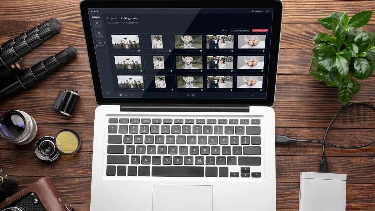
Because it works from a personal profile built on your own choices, the results look like you edited them, not like a generic filter. Pricing is straightforward pay on export: exploring the tools is free, and pay-as-you-go photographers pay for what they export, which keeps large restaurant and cookbook shoots easy to estimate. For a shoot with a strict deadline, batch consistency at this speed is the difference between delivering the same night and grading through the weekend. You can see the batch workflow, now part of a Studio where you cull, edit and export in one project, on the Imagen homepage.
A quick pre-delivery color checklist
Before you export a food set, run a fast pass to catch the errors that slip through when you are deep in a single frame. First, pull up two or three images side by side and check that the same ingredient reads the same color across them. A bun that is golden in one shot and gray in the next is the most common consistency miss. Second, look at your whites: a plate, a napkin, a splash of cream should be neutral, not tinted. Third, glance at the darkest shadows to make sure they have not picked up a color cast during grading. Fourth, confirm the reds still hold texture and have not clipped. Fifth, check that any background surface still looks like the material it is made of. A checklist like this takes a minute per batch and saves you from a client spotting the drift you missed.
It also pays to view your images on more than one screen if you can. A grade that looks warm and inviting on a bright, cool monitor can turn sallow on a phone. Food is very often browsed on phones, so a quick look at how a hero shot holds up on a small mobile display is a smart final step before you hand the set over.
Where a dedicated tool fits instead
Color grading and cleanup are different jobs, and it helps to keep them separate in your workflow. If a frame needs a stray crumb erased, a reflection removed, or a background rebuilt, that is object removal and compositing work for a dedicated retouching tool, not a color pass. Likewise, true HDR bracket-merging, where you blend several exposures of a dim restaurant interior into one clean file, is a separate exposure-blending step handled by a dedicated tool. Grade for color and tone first, then send the rare problem frame out for that specialized fix.
What’s new in Imagen: Imagen is now an intelligent, agentic Studio for professional photographers, where one project covers culling, editing, review and export in any order. Your Personal AI Profile learns your food grade from past edits, and the assistant can find photos and act on them when you ask in plain language, with you steering. It is rolling out gradually as a beta.
Frequently asked questions
Should I color grade food in RAW or JPEG? Always grade from RAW when you can. RAW keeps the full color information and lets you correct white balance and recover highlights without the banding and artifacts that show up when you push a JPEG. For food, where subtle red and cream tones matter, that extra latitude is worth it.
How do I keep all my food photos looking consistent? Start from a saved preset or an AI profile built on your own edits, apply it across the whole shoot, and fine-tune each frame instead of grading from scratch. Consistency comes from a shared starting point plus small per-image adjustments, not from redoing every plate independently.
What is the most common color grading mistake in food photography? Over-saturating the reds and oranges. It is tempting because those colors read as fresh, but pushing them too far flattens surface texture and makes food look plastic. Use vibrance first, and back off the moment detail starts to disappear.
Can AI color grade food photos accurately? AI grading works well when it learns from your own past edits rather than applying a generic look. A personal profile can carry your white balance, warmth, and saturation choices across a whole batch of RAW files, keeping color honest to the ingredient while saving you the repetitive slider work.
