

Beginner White Balance Correction for Product Photographers: Where to Start
Table of contents
- What white balance actually measures
- Why product photography is less forgiving than other genres
- Common white balance mistakes beginners make
- Setting white balance correctly at capture
- Correcting white balance in post-production
- How Imagen helps you keep white balance consistent across a shoot
- Building a repeatable white balance workflow
- Frequently asked questions
The fastest place to start with white balance correction is your camera’s custom white balance setting, using a gray card or white card shot under the same light as your product. From there, you fine tune in your RAW editor using the Kelvin slider and the tint slider together, matching one hero image, then applying that same setting across the rest of the shoot so every product photo shares one consistent color temperature.
For beginner product photographers, white balance mistakes usually show up as a yellow or blue cast that makes white backgrounds look dirty, or as color shifts between images shot in the same session. The fix is not complicated once you understand what white balance is actually measuring and where in your workflow to correct it. This guide walks through the basics, the most common early mistakes, and a simple correction routine you can repeat on every shoot.
What white balance actually measures
White balance describes how your camera or editor interprets the color of light in a scene, so that something white actually renders as white rather than tinted yellow, orange, or blue. Light sources have a color temperature measured in Kelvin. Warm household bulbs sit around 2700 to 3000K, cloudy daylight sits around 6500 to 7500K, and typical studio strobes or daylight-balanced LED panels sit close to 5000 to 5600K. Your camera has to guess which temperature it is looking at, and on auto white balance it often guesses wrong, especially under mixed light or colored backdrops.
A second, less obvious factor is tint, which corrects a green or magenta cast that Kelvin alone cannot fix. Many beginner photographers adjust only the Kelvin slider and wonder why their whites still look slightly green. Tint usually comes from fluorescent tubes, some LED panels, or bounced light off a colored wall or table, and it needs its own correction pass alongside Kelvin.
It helps to think of Kelvin and tint as two separate dials that solve two separate problems. Kelvin moves the overall image warmer or cooler, correcting the orange to blue axis of color. Tint moves the image toward green or toward magenta, correcting the axis that Kelvin cannot touch. A photo can have perfect Kelvin and still look slightly off if the tint is wrong, which is why relying on Kelvin alone is one of the most common reasons beginner white balance corrections never quite look right.
Why product photography is less forgiving than other genres
A portrait with a slightly warm cast can still look pleasant, even flattering. A product photo with the same cast looks like a quality problem. Shoppers judge color accuracy instantly on packaging, apparel, cosmetics, and anything with a white or neutral background, because they are comparing what they see on screen to what they expect to receive. A sweater that reads as pale gray instead of true white, or a red product that leans orange, creates returns and support tickets, not just a less attractive photo.
Consistency across a catalog matters just as much as accuracy in any single frame. If your white background reads pure white in one image and slightly cream in the next, the whole listing looks unprofessional even if no single photo is technically wrong. That is why professional product workflows treat white balance as a batch problem, not a single-image edit.
Common white balance mistakes beginners make
The most frequent mistake is trusting auto white balance for an entire shoot instead of locking a custom setting once conditions are confirmed. Auto white balance recalculates per frame, so it can drift slightly from shot to shot even under lighting that never actually changed, which is exactly what creates inconsistency across a catalog.
Another common issue is correcting white balance by eye on an uncalibrated monitor, or in a room with strong ambient light hitting the screen. What looks neutral on a warm-toned laptop display in a yellow-lit room can look distinctly cool everywhere else. Beginners also frequently mix light sources, shooting a product under a window near a warm desk lamp, which creates a scene with two different color temperatures that no single white balance setting can fully resolve.
Finally, many beginners skip a gray card entirely and try to guess a Kelvin value from memory or from a preset. Presets are a reasonable starting point, but they assume a specific light source that may not match your actual setup, so they should be treated as a rough draft rather than a final answer.
Setting white balance correctly at capture
The most reliable habit to build early is shooting a gray card or white balance card as the first frame of every lighting setup, then using your camera’s custom white balance function to sample that frame. Most cameras have a menu option for this, sometimes called custom or preset white balance, where you point the camera at the card and let it calculate the correct Kelvin and tint values automatically.
If your camera does not support in-camera custom white balance, shoot the gray card anyway and use it as your reference point later in post-production. Keep the card in the same light as your product, not in shade or under a different bulb, since even a small difference in light source will throw off the sample. Shooting in RAW rather than JPEG is worth mentioning here too, because RAW files store the full sensor data and let you adjust white balance non-destructively after the fact, while JPEG bakes the white balance decision in at capture.
Correcting white balance in post-production
Once your RAW files are imported, start with the gray card frame. Use the white balance eyedropper tool on a neutral gray or white patch on the card, which sets a baseline Kelvin and tint value for that lighting setup. From there, apply the same setting to every other image shot under the same light, either by copying the edit or by syncing white balance across the selected files.
Fine tune by eye afterward, since even a well-sampled gray card can need a small nudge depending on your monitor and your product’s actual color. Zoom into the background and check that white truly reads white, not cream or pale blue, then check the product itself against a reference if you have one, such as the actual physical item next to your screen. Small adjustments of a few hundred Kelvin or a couple of tint points are normal and expected at this stage.
How Imagen helps you keep white balance consistent across a shoot
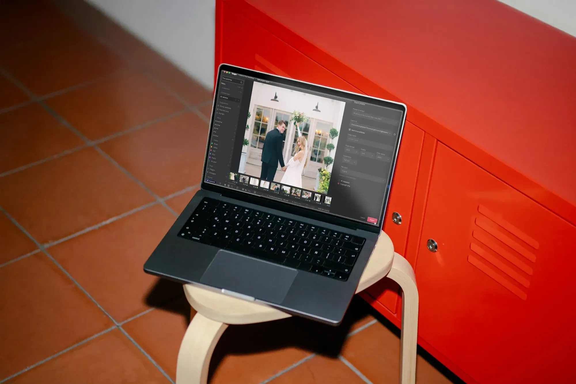
Correcting one image is straightforward once you know the steps above. The harder part for most beginner product photographers is applying that same correction consistently across fifty, two hundred, or a thousand images from one shoot, especially when lighting shifted slightly between setups or sessions. Imagen’s AI white balance correction is built for exactly this problem. You edit a handful of representative photos the way you want the whole set to look, and Imagen’s AI style profile learns your color and white balance preferences, then applies that same look consistently across the rest of the shoot through your Personal AI Profile. It works directly on RAW files in a desktop app for Mac and Windows with the AI processing in the cloud, and it also handles culling, with AI filters such as blur to help you narrow a shoot, so you are not sorting duplicates and blurry frames by hand before you even get to color. Tasks like heavy compositing or full geometry correction still belong to a dedicated tool for that specific job, but for consistent color and white balance across a whole catalog, batch correction is where most of the time savings happen.
Pricing is straightforward too. Pay as you go pairs a monthly base fee with a charge for the photos you export, so the cost scales with how many photos you actually deliver.
Building a repeatable white balance workflow
Turn the steps above into a checklist you use on every shoot rather than relearning them each time. Shoot a gray card first under every new lighting setup. Confirm you are shooting RAW. Set a custom white balance in camera when your gear supports it, and sample the gray card in post-production either way. Apply that sampled setting across the full set of images from that light source, then do a final visual pass on a calibrated or at least a known-neutral monitor before calling the batch finished.
Keep a short log of the Kelvin and tint values that worked for each light source you use regularly, whether that is a specific studio strobe, a softbox with a particular bulb, or a window at a certain time of day. Over time this turns white balance from a per-shoot guessing game into a known reference you can apply immediately, which is one of the fastest ways beginners can shorten their editing time without cutting corners on quality. A simple spreadsheet with the light source name, the sampled Kelvin value, and the tint adjustment is enough, and it saves real time on repeat shoots in the same studio corner or with the same rented lighting kit.
As your catalog grows, moving repetitive batch correction into a workflow built for it, rather than adjusting each image by hand, tends to be the difference between editing being a bottleneck and editing keeping pace with how many products you actually need to shoot. You can see how Imagen’s new Studio, where you cull, edit and export in one project, fits into a product photography workflow on Imagen’s website.
What’s new in Imagen: Imagen is now an intelligent, agentic Studio for professional photographers, one project where you cull, edit, review and export together. Product sets often mix lighting setups, so you can apply more than one AI Profile to a selected set of photos, which takes some processing time, and compare the looks while you review. The Studio is rolling out gradually as a beta, and the details are at Imagen.
Frequently asked questions
What is the best white balance setting for product photography? There is no single universal setting, since it depends on your actual light source. A gray card sample taken under your specific lighting will always be more accurate than a fixed preset, because it accounts for your exact bulbs, strobes, or window light rather than an average assumption.
Can I fix white balance after the shoot if I shot JPEG instead of RAW? You can make some correction to a JPEG, but the results are more limited and can introduce banding or color shifts in the highlights and shadows, because JPEG has already discarded some of the original sensor data. RAW gives you much more room to correct white balance cleanly after the fact.
Why do my product photos look different from each other even though I did not change my lighting? This is almost always caused by relying on auto white balance, which recalculates per frame and can drift slightly between shots even under light that never actually changed. Locking a custom white balance setting, or applying one sampled value across the whole batch afterward, solves this.
How do I know if my white background is actually neutral and not slightly tinted? Zoom into the background at full resolution and check it against a true white reference, either a physical card or a known neutral value in your editor’s color picker. A subtle cream or blue tint is easy to miss at a glance but becomes obvious once you compare pixel values directly.
