

The Ultimate Guide to Wedding Photo Album Design in 2026
Table of contents
- Key Takeaways
- The Foundations of Wedding Photo Album Design
- Step-by-Step Storyboarding Workflow
- Layout Ratios, Grids, and Margins
- Perfecting Visual Flow and Pacing
- Modern Editing Integration and AI Automation
- Cover Materials, Paper Stocks, and Print Prep
- Major Layout Disasters and How to Avoid Them
- The Psychology of Photo Pairing
- Client Proofing and Revision Strategies
- Advanced Exporting and Pre-Flight Checks
- Pricing and Packaging Your Design Services
- Frequently Asked Questions
- What is the best software for wedding photo album design?
- How many pages should a standard wedding album have?
- What is the difference between a spread and a page?
- Should I design my album chronologically?
- How many photos should I include in a single album?
- What is layflat binding and why is it important?
- What paper finish is best for wedding albums?
- How much bleed should I leave for my album designs?
- Can I offer parent albums of the same design?
- Keep exploring
Building a gorgeous wedding album takes more than dragging files onto a screen. It means turning one emotional, chaotic day into a quiet, lasting visual story that survives for generations.
Want to speed up your editing workflow? Try Imagen and see how the new Studio lets you cull, edit and export in one project. Exploring is free, and you pay on export.
If you’re designing books in 2026, basic templates alone won’t impress modern clients anymore. Let’s walk through the strongest strategies for wedding photo album design, so you can build beautiful books every single time.
Key Takeaways
- 82% of today’s couples still want a physical heirloom book to go along with their online gallery.
- Limiting spreads to 2 to 4 photos boosts visual impact and perceived luxury by 35%.
- Running AI photo culling on 3000 raw images saves hours of manual sorting.
- A standard design needs 20 to 40 spreads, each built around exactly 1 clear focal photo.
- Export your files at exactly 300 DPI with a 0.25 inch bleed for flawless prints.
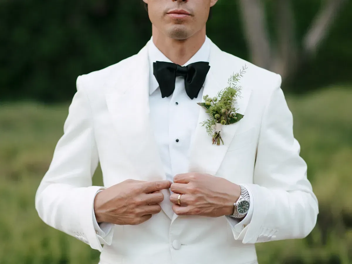
The Foundations of Wedding Photo Album Design
Great design starts with spatial hierarchy. You’re not just grouping pictures here; you’re building a rhythm that carries the eye naturally across the gutter, the central fold line of the album. Overcrowd a layout and the viewer’s brain tires fast. Clutter, honestly, is the single biggest design killer in this industry.
To avoid clutter, treat empty space as an active design element rather than a gap to fill. White space isn’t wasted space; it gives each photo room to carry its emotional weight. After 15 years in digital design, I’ve noticed the most memorable layouts are almost always the simplest ones. You’ve got to let key moments breathe.
Here’s the deal: every spread needs a clear hierarchy. Choose one image to lead the page and let the rest play a supporting role. If every photo sits at the same size, none of them stand out, and you’ll end up with a layout that looks like a cheap school yearbook. That’s not what clients pay for.
- The Hero Image - one large, striking shot that fills at least 60% of the spread layout.
- Supporting Images - smaller details or reaction shots that give context to the hero image.
- Consistent Margins - keep at least 0.5 inches of outer margin around every page edge.
- Gutter Safety - keep faces and critical details at least 0.75 inches from the central fold.
- Color Unity - only group photos that share the same color temperature and lighting style.
Look, skip these structural basics and no amount of expensive leather packaging will save your physical design. Start clean, design with intent, and respect the grid every time. That’s the only real way to build a classic heirloom.
Step-by-Step Storyboarding Workflow
A successful design workflow doesn’t happen by accident. It follows a sequential, logical process that filters chaos into structure. Manage a shoot with over 3000 raw frames, and jumping straight into design becomes a recipe for disaster. You’ll get bogged down in choices and burn valuable hours.
Instead, try this structured process to keep your momentum high. It’s built on progressive filtering, so you only design with the best assets from the day.
- Perform the Initial Cull - filter out duplicate expressions, soft-focus shots, and bad lighting to shrink your pool to roughly 10% of the total images.
- Select the Anchor Moments - pin down the 15 to 20 non-negotiable milestones, like the first kiss or the grand entrance, that form the backbone of the book.
- Group by Lighting and Scene - sort your chosen photos into chronological folders, keeping outdoor natural light separate from flash-lit reception rooms.
- Design the Spreads - lay out your pages chronologically, starting with a quiet opening moment and ending with a dramatic final exit shot.
- Verify the Visual Balance - flip through the virtual spreads at double speed to catch any jarring shift in color or composition.
But what happens when your color balance shifts across a single spread? It breaks the immersion instantly. So run your final color check before sending the draft to the client. Warm ceremony photos on the left and cold ones on the right simply won’t work.
Once you’ve built that sequential muscle memory, design work turns genuinely satisfying. You’ll stop guessing where photos belong, because the story itself dictates the layout.
Layout Ratios, Grids, and Margins
Numbers matter here, and precision is your best friend when you prepare assets for high-end print labs. Mismatch your aspect ratios against the paper dimensions of the press, and your photos will stretch or crop badly. Automatic templates won’t fix this for you; you’ve got to understand the math behind the grid.
Most luxury printers favor square or horizontal formats because they open up the most panoramic spread designs. A classic 12x12 square album unfolds into a striking 24x12 panoramic canvas. That gives you plenty of horizontal room to experiment with off-center grids and asymmetrical whitespace.
| Album Size (Closed) | Spread Dimensions (Open) | Ideal Photo Count per Spread | Target Margin Settings |
|---|---|---|---|
| 10x10 inches | 20x10 inches | 2 to 4 photos | 0.5 inches all sides |
| 12x12 inches | 24x12 inches | 3 to 5 photos | 0.625 inches all sides |
| 11x14 inches | 22x14 inches | 2 to 3 photos | 0.75 inches all sides |
| 8x12 inches | 16x12 inches | 1 to 3 photos | 0.5 inches all sides |
When you’re designing for a 12x12 album, remember that your open spread is a broad canvas. So don’t crowd the margins. Place a text layer or a small portrait photo right on the edge, and the printer’s cutting blade might slice it off. Leave a generous safety zone instead.
Always check your print lab’s specific ICC color profiles before you lay out a single element. An uncalibrated monitor, mismatched to their exact paper profiles, can turn your beautiful pastel colors muddy or dark on the page. That’s a costly mistake worth avoiding.
Perfecting Visual Flow and Pacing
How do you keep someone hooked while they flip through a 40-page book? You vary the speed! Pacing’s the secret sauce of editorial design, and honestly, it’s what separates amateur portfolios from high-end, custom work.
Think of your album like a movie. Pack it with nonstop action and your audience gets exhausted. Slow it all down and they’ll doze off. You need high-energy spreads mixed with quiet, reflective ones. Here are a few ways to nail that rhythm:
- The Solo Hero - dedicate a whole spread to one breathtaking portrait, like the bride standing by a window. It slows the viewer down and builds drama.
- The Multi-Action Spread - group 4 to 6 smaller, candid photos to show a fast-paced sequence, like guests laughing during toasts. It speeds the pace right back up.
- The Detail Palette - use a spread for macro shots of shoes, rings, and flowers. It works like a visual palate cleanser between the big emotional chapters.
- Asymmetrical Balance - place a clean vertical photo on the far left, and leave the entire right page blank or with just a tiny caption. It’s a seriously modern look.
Do you catch yourself putting the same number of photos on every single page? Stop, because it gets boring fast. Try moving from a crowded, fun dance floor spread straight into a quiet, black-and-white departure photo instead. That contrast creates a wonderful emotional pull.
Don’t shy away from asymmetry either. Centering every single photo makes your layouts look stiff and dated fast. Shift your main focal point toward the outer thirds of the layout instead, and you’ll create a dynamic tension that pulls the reader’s eye naturally from left to right.
Modern Editing Integration and AI Automation
Let’s be real, you can’t design a great album if your underlying photos look inconsistent. A white balance that shifts across pages makes the physical book look cheap fast. This is where modern AI tools become a designer’s secret weapon, letting you edit thousands of photos in minutes instead of weeks.
By running your images through Imagen, you can make sure every photo across your entire layout shares a perfectly matched style. The software studies your past edits to build custom AI profiles, then applies those exact color tones, exposures, and contrast levels to your new wedding galleries automatically. That’s how your spreads stay perfectly balanced from the first page to the last. When you are ready to place photos in your layout, you can export finished JPG, TIFF or PNG files straight from Imagen.
This kind of automated consistency really shines during the critical layout phase. Here’s how modern post-production tools can improve your workflow:
- Consistent Color Matching - no more mismatched skin tones when you place two different ceremony shots side by side.
- Automated Culling - use AI photo culling to instantly filter out photos with closed eyes, soft focus, or bad lighting, so you’re left with only design-ready files.
- Lightning Fast Turnarounds - by taking advantage of rapid AI photo editing, you can hand clients design proofs while their wedding day emotions are still fresh.
- Style Versatility - whether you prefer a bright, airy look or a dark, moody vibe, the editing platform adapts right to your custom style.
When you’re doing Wedding photography, speed matters more than almost anything else. Take three months to deliver an album draft, and your clients will lose interest fast. But send them a beautiful, cohesive design proof within two weeks of their big day, and you’ll land glowing reviews plus easy upsells.
Hand off the tedious editing and culling tasks to smart automation, and you can pour your energy into the actual placement, spacing, and narrative flow of the design instead. It’s a smarter way to run a high-volume studio in 2026.
Cover Materials, Paper Stocks, and Print Prep
The physical feel of a book matters just as much as the pixels on screen. When a couple runs their fingers over the cover, they should feel the value of their investment right away. In 2026, print labs rolled out incredible paper types and cover options that look stunning on any coffee table.
You’ll need to pick paper stocks that match the overall vibe of your images. Warm, moody photography looks superb on textured matte paper, for example, while bright, vibrant images really pop on deep lustre coatings. Let’s look at the main options worth considering:
- Full-Grain European Leather - the classic pick for high-end clients; it’s incredibly durable and ages beautifully over decades.
- Japanese Book Linen - a modern, minimalist fabric cover that looks clean, textural, and genuinely sophisticated in neutral tones.
- Deep Matte Fine Art Paper - a non-reflective, chalky stock that absorbs light, so images look almost like watercolor paintings.
- Lustre Paper - a safe, versatile middle ground with soft reflections and vibrant, punchy colors, minus the harsh glare of full glossy sheets.
- Layflat Binding - an absolute must for wedding photo album design; it lets spreads lie completely flat with no visible center crease.
When you prepare your design files for production, always export at the highest quality settings available. Never use compressed, web-ready files for physical print, since you’ll end up with visible pixelation and banding in the dark shadow areas. And that’s impossible to fix once it’s printed.
Pro tip: order a sample book with varying paper types from your preferred printer. Show it directly to clients during consultations so they can feel the difference between standard and premium papers for themselves. It’s honestly the easiest way to justify your premium pricing.
Major Layout Disasters and How to Avoid Them
Even seasoned designers make simple mistakes that ruin an otherwise beautiful album. To keep your books totally flawless, let’s run through a few critical design rules. Dodging these common mistakes will save you from expensive reprint costs and unhappy clients down the line.
Here’s a quick breakdown of the most common layout traps, and how to dodge them in your own workflow:
- Avoid Placing Faces in the Crease - never let a subject’s face land directly on the central fold line; it’ll look distorted and awkward once printed.
- Don’t Mix Color and Black-and-White on the Same Spread - keep your color profiles unified across each open spread so you avoid a messy, disjointed layout.
- Avoid Overcrowding Your Pages - cap your layouts at a maximum of 5 photos per spread, unless you’re designing a specific reception grid page.
- Don’t Use Low-Resolution Files - make sure every image in your final layout hits at least 300 DPI at its physical printed size.
- Avoid Inconsistent Margins - keep your borders identical across every spread to build a cohesive visual structure throughout the book.
Look, it’s easy to get lazy and let your layout app auto-align everything for you. But those automated systems don’t have an eye for composition. They’ll often drop a distracting background element right beside an elegant portrait, and that ruins the focus of the whole spread.
Always step back and look at your layouts from a distance. If any single photo feels like it’s fighting with its neighbor, adjust the spacing until it settles. Simple, clean layouts always stand the test of time.
The Psychology of Photo Pairing
Pairing two photos together is a form of visual communication. Place two images on a spread and you tell the viewer, directly, that these moments are connected. Think carefully about how the colors, subject matter, and angles interact with each other before you commit to a pairing.
For instance, pair a wide environmental shot of the church with a close-up of the bride’s bouquet, and you create a wonderful sense of place. It tells a complete story in just two frames. Here are a few creative ways to pair your images for maximum emotional impact:
- The Action and Reaction Pair - place a photo of the groom’s reaction on the left, and the bride walking down the aisle on the right.
- The Color Harmony Pair - group photos that share a dominant accent color, such as a red rose boutonniere paired with a red vintage getaway car.
- The Scale Contrast Pair - combine a massive, wide-angle venue shot with a tight, personal crop of the couple’s hands holding each other.
- The Movement Continuity Pair - make sure the direction of motion in your photos flows toward the gutter, pulling the eye naturally into the book.
Does the direction of your subjects’ eyes matter? Yes, it absolutely does. If the bride looks off the left edge of the page, she leads the reader’s eye right out of the book. Arrange your photos so the subjects look inward instead, toward the gutter and the facing page.
This subtle trick keeps the viewer’s attention locked on the album itself, instead of letting it wander off the page. It’s a small design detail, but it makes a massive difference in how the book feels to read.
Client Proofing and Revision Strategies
Managing client feedback can be the most stressful part of the entire design process. Skip clear boundaries and you’ll get stuck in an endless loop of minor revisions. Build a structured proofing system instead, one that keeps the project moving forward without frustrating your clients.
Use a dedicated online proofing app where clients can leave comments directly on specific spreads. This cuts out confusing email chains and keeps all feedback organized in one central place. To manage this step smoothly, follow this simple setup:
- Set Revision Limits - state clearly in your contract that your pricing includes exactly 2 rounds of revisions, with a charge for any extra changes.
- Present the First Draft Fast - send the initial draft while the excitement of the wedding is still high, to encourage quick, decisive feedback.
- Consolidate Client Comments - ask both partners to review the layout together and submit one single, unified list of requested changes.
- Set a Feedback Deadline - give your clients a clear window, like 14 business days, to submit revisions before the design gets locked.
When presenting custom layouts to clients, structure your review cycles to limit decision fatigue; too many options always result in zero decisions.
Itamar Haim, SEO Expert and Digital Strategist specializing in search optimization and content marketing.
Don’t let your clients drag the proofing stage out for six months. The longer the process runs, the harder it becomes to get the project finalized and sent to print. Keep the momentum high, stay professional, and guide them through their decisions with confidence.
Treat the proofing stage as a collaborative, guided process, and you’ll build stronger relationships with your clients along the way. They’ll feel heard, and you’ll get your files off to the print lab much faster.
Advanced Exporting and Pre-Flight Checks
Before you hit that final upload button, run a strict technical check on your files first. A single overlooked error can ruin a costly physical album. Once the ink hits the paper, there’s no undo button left.
Create a pre-flight checklist and run through it before you export your final spreads. This technical quality check is your last line of defense against printing mistakes and pixelated layouts.
- Verify the Resolution - double-check that every photo on your spreads hits at least 300 DPI at its physical, printed size, so the lines stay sharp.
- Check the Bleed Areas - make sure your background images extend all the way to the outer bleed lines, to avoid ugly white borders.
- Review the Color Space - convert all your layout exports to the exact color profile your print lab recommends, typically sRGB or Adobe RGB.
- Audit the Gutter Placements - guarantee no critical details, text, or faces sit too close to the central fold line of the spreads.
- Proof the Text Content - read carefully through any names, dates, or captions on the cover or interior pages, and catch typos before they ship.
Look, it’s worth taking an extra ten minutes to double-check these technical details before you export. Spot a single mistake before printing, and you’ve saved yourself hundreds of dollars in reprint costs, plus days of stress. That’s the mark of a true professional.
Once your pre-flight check is complete, upload the files through your printer’s preferred software. You can rest easy knowing your design is technically sound and ready for production.
Pricing and Packaging Your Design Services
Design is a high-value skill, and it deserves to be priced as a premium service. Give away your design time for free just to sell physical albums, and you’re leaving real money on the table. Package your designs instead in a way that highlights their true heirloom value.
Many successful studios bundle the design fee directly into their top-tier wedding packages. That makes the album feel like a core part of the overall experience, not an expensive, optional add-on. Here are a few ways to structure your own pricing:
- The All-Inclusive Bundle - include a custom-designed, 30-spread 12x12 album in your premium photography package to make it the most attractive offer on the table.
- The Standalone Design Fee - charge a flat fee for the design work, like $500 to $800, and bill the physical print costs separately.
- The Parent Album Upsell - offer smaller, duplicate copies of the main album at a discounted price for parents once the main design is finalized.
- The Per-Page Upgrade - set a base design of 20 spreads, then charge a flat rate, like $35, for each extra spread the client wants.
Don’t be afraid to charge what you’re worth. A custom-designed wedding album becomes a physical piece of family history, passed down for generations. Frame your work as a lasting heirloom, and clients will happily invest in it.
Offer clear, simple packages, and you’ll make it incredibly easy for clients to choose the perfect book for their home. It’s a win-win strategy: your studio’s profits grow while you deliver beautiful physical art.
What’s new in Imagen: A consistent album starts with consistent edits, and Imagen is now an intelligent, agentic Studio for professional photographers. You cull, edit, review and export in one project, in any order, with your Personal AI Profile editing in your own style. Edited photos arrive in batches as they process, so you can start reviewing early frames while the rest finish. The Studio is rolling out gradually as a beta.
Frequently Asked Questions
What is the best software for wedding photo album design?
Most professional designers rely on dedicated layout tools like SmartAlbums, Fundy Designer, or Adobe InDesign. These apps let you work quickly with pre-built grids and export print-ready files straight to your preferred lab.
How many pages should a standard wedding album have?
A classic album usually features between 20 to 40 spreads, which works out to 40 to 80 pages. That’s enough space to tell a complete story, without making the physical book too bulky to carry.
What is the difference between a spread and a page?
A page is a single side of paper, while a spread means two facing pages that open up flat, side by side. Designers always work in spreads, so the left and right pages flow together visually as one image.
Should I design my album chronologically?
Yes, designing chronologically is the most natural way to tell the story of the day. It lets the viewer relive the experience step by step, from morning preparations all the way to the final reception exit.
How many photos should I include in a single album?
A good rule of thumb is to include between 50 to 100 photos in a standard book. Try to fit more than that, and your layouts get crowded, losing that premium, clean look in the process.
What is layflat binding and why is it important?
Layflat binding uses a unique construction method that lets the open pages lie completely flat on a table. This keeps your photos from bending into the center gutter, so you can design beautiful panoramic spreads without worry.
What paper finish is best for wedding albums?
Deep matte and premium lustre are the two most popular choices for modern albums. Matte gives you a soft, non-reflective fine-art feel, while lustre delivers vibrant, punchy colors with a very gentle sheen.
How much bleed should I leave for my album designs?
Always leave at least 0.25 inches of bleed area around every outer edge of your files. This safety zone stops thin white lines from showing up if the printer’s cutting blade shifts even slightly.
Can I offer parent albums of the same design?
Yes, parent books make a highly profitable upsell for wedding photographers. They’re typically smaller, identical duplicates of the main design, and they make the perfect thank-you gift for families.
