

12 Photo Editing Styles Every Photographer Should Know (2026)
Table of contents
- 1. Light and Airy
- 2. Dark and Moody
- 3. True-to-Life
- 4. Matte and Film
- 5. Warm and Golden
- 6. High-Contrast Black and White
- 7. Clean Commercial
- 8. Vibrant
- 9. Muted and Earthy
- 10. Cinematic Teal and Orange
- 11. Bright and Clean Real Estate
- 12. Editorial
- How Imagen Keeps Your Chosen Style Consistent Across the Whole Shoot
- How to Choose the Right Editing Style for Your Work
- Frequently Asked Questions
Your editing style is your signature. Before a client can name a single thing you did in post, they feel it: the airy glow of a morning wedding, the deep shadows of a moody portrait, the clean neutral tone of a product shot. Learning the main photo editing styles gives you a vocabulary for that feeling, so you can choose a look on purpose instead of stumbling into it. This guide walks through 12 photo editing styles worth knowing in 2026, what defines each one, and who each suits, so you can pick the direction that fits your work and your clients.
None of these styles is better than the others in the abstract. Each one solves a different problem and flatters a different subject. Read each entry for the job it does best, and pay attention to the “Best for” line, because that is where a style stops being a mood board idea and starts being a practical choice for the shoots you actually book.
1. Light and Airy
Light and airy is built on brightness, soft contrast, and gentle pastel tones. Shadows are lifted so nothing reads as heavy, whites lean bright and clean, and skin tones stay warm without going orange. The overall feeling is fresh, romantic, and open, like a room full of window light. It works because it flatters people and spaces at the same time, which is why it became a signature look for so many wedding and lifestyle photographers.
Best for: Wedding, newborn, and lifestyle photographers who want a soft, romantic, timeless feel that clients read as bright and joyful.
2. Dark and Moody
Dark and moody is the opposite instinct. You deepen the shadows, pull back the highlights, and let rich, muted color carry the frame. Contrast is strong, blacks are genuinely dark, and the mood turns personal and dramatic. Done well, it feels cinematic and emotional rather than simply underexposed. The trick is protecting skin tones and important detail inside those deep shadows so the image stays readable and never muddy.
Best for: Wedding, portrait, and fine-art photographers who want drama, closeness, and a rich, emotional atmosphere.
3. True-to-Life
True-to-life editing aims for accuracy over interpretation. Colors match what the eye saw, white balance is neutral, skin tones look natural, and contrast stays realistic. The goal is a clean, faithful rendering with no obvious filter, so the viewer trusts that the scene really looked this way. It takes discipline, because the restraint that makes it look effortless is easy to overshoot into something flat or oversaturated.
Best for: Documentary, family, and event photographers, plus anyone whose clients value authenticity and accurate color over a stylized mood.
4. Matte and Film
The matte and film style softens the extremes. Blacks are lifted so the darkest areas read as deep gray rather than pure black, highlights are held back, and a subtle grain and faded color cast recall analog film stock. The result feels nostalgic and understated, with a gentle, low-contrast finish. It pairs beautifully with warm light and works well when you want images to feel timeless rather than crisp and modern.
Best for: Wedding, editorial, and lifestyle photographers who want a nostalgic, analog-inspired look with a soft, faded finish.
5. Warm and Golden
Warm and golden editing pushes the whole frame toward amber and honey tones, echoing the light of early morning and late afternoon. Whites carry a touch of warmth, skin glows, and the image feels cozy and inviting. The style leans on golden-hour color even when the shoot happened at another time of day. The main risk is letting the warmth tip skin into orange, so a careful hand on the highlights keeps it flattering.
Best for: Couples, engagement, and outdoor portrait photographers who want a cozy, sun-drenched, golden-hour feeling.
6. High-Contrast Black and White
Stripping color forces everything onto light, shadow, and texture. High-contrast black and white leans into that with deep blacks, bright whites, and a full tonal range that makes structure and emotion pop. Without color to carry the image, composition and expression do all the work, which is exactly why photographers reach for it when a frame is about a moment rather than a palette. It is timeless, graphic, and forgiving of mixed or difficult lighting.
Best for: Street, documentary, and portrait photographers who want timeless, graphic images driven by emotion and form.
7. Clean Commercial
Clean commercial editing is precise and neutral. Backgrounds are even, color is accurate, contrast is controlled, and nothing distracts from the subject. The look prioritizes clarity and consistency over mood, because the image usually has to sell a product, represent a brand, or sit in a catalog next to dozens of others. Every frame needs to match, which makes consistency the real skill here, not any single dramatic move.
Best for: Product, e-commerce, and brand photographers who need clean, accurate, distraction-free images that stay consistent across a catalog.
8. Vibrant
The vibrant style turns up saturation and contrast for bold, punchy color that grabs attention. Blues get deeper, greens get richer, and the whole frame feels energetic and alive. It thrives on scenes that already carry strong color, like landscapes, travel, and events, and it reads well on screens and social feeds where you have a split second to stop the scroll. The discipline is knowing when to pull back, since pushed too far it turns garish and skin tones suffer.
Best for: Travel, landscape, and event photographers who want energetic, eye-catching images that stand out on social media.
9. Muted and Earthy
Muted and earthy editing dials saturation down rather than up, favoring soft, desaturated tones drawn from a natural palette of greens, browns, and warm neutrals. The mood is calm, grounded, and organic. It suits outdoor and lifestyle work where you want the image to feel relaxed and unforced rather than punchy. Because it removes color intensity, it relies on good light and texture to keep frames from feeling lifeless.
Best for: Outdoor, boho wedding, and lifestyle photographers who want a calm, natural, understated palette.
10. Cinematic Teal and Orange
Borrowed from film color grading, the cinematic teal and orange look pushes shadows toward cool teal while skin tones and highlights stay warm and orange. That complementary split gives images a polished, movie-still quality with strong depth and separation between subject and background. It is a deliberate, stylized choice that signals production value. The balance matters, because overdone teal in the shadows can drain the life out of a scene.
Best for: Event, branding, and video-first photographers who want a polished, cinematic, film-graded feel.
11. Bright and Clean Real Estate
Interior and property work has its own house style, and it is unmistakable. Bright and clean real estate editing means well-exposed rooms, straight verticals, neutral white balance, and true-to-life color so a space looks open, inviting, and accurate. Windows are balanced against interior light, and the whole set has to match from room to room. The point is to help a buyer picture the space honestly, which makes consistency and accuracy far more important than mood.
Best for: Real estate and interior photographers who need bright, accurate, consistent images across an entire property.
12. Editorial
Editorial editing is the magazine look: refined contrast, deliberate color, and a polished finish that feels styled without shouting. It sits between true-to-life accuracy and heavy stylization, adding just enough character to feel designed for a spread or a brand story. Skin is clean, tones are intentional, and the image reads as considered from corner to corner. It rewards a photographer with a clear point of view, because the whole style is about taste and restraint.
Best for: Fashion, brand, and portrait photographers producing polished, magazine-ready images with a clear creative point of view.
How Imagen Keeps Your Chosen Style Consistent Across the Whole Shoot
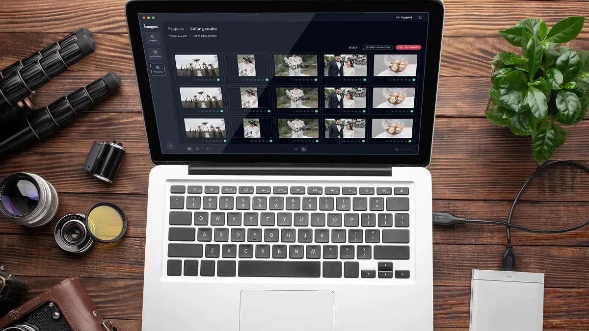
Picking a style is the easy part. Applying it to 1,500 frames, from a shaded ceremony to a warm reception, without the look drifting halfway through, is where the hours disappear. This is the layer Imagen is built for. Imagen is a desktop app for Mac and Windows that learns your personal editing style and applies it across an entire shoot with batch editing, and its new Studio lets you cull, edit and export in one project. Whichever of these 12 looks you commit to, whether it is light and airy, dark and moody, or bright and clean real estate, it handles color correction, exposure, and white balance in that consistent style on every frame, so the gallery reads as one coherent set rather than a patchwork of separate edits.
Culling runs in the same flow, narrowing the burst of near-identical frames before you spend a second scrolling, and the first batch finishes in under 10 minutes. Where a single frame needs individual attention, the AI Assistant handles per-photo finishing like object removal and background blur. Pricing is pay-as-you-go, so you pay for what you export, and exploring the tools is free. It is worth being clear about the limits: Imagen applies and finishes your look, it does not sharpen or deblur a soft capture, and it does not generate images from scratch. Within its lane, keeping your chosen style consistent across volume, it removes the bottleneck that a distinctive edit usually creates.
How to Choose the Right Editing Style for Your Work
Start with your genre and your clients, because those two facts point straight at the answer. Wedding and lifestyle work often lives on light and airy or matte and film, portraits can swing from dark and moody to editorial, and commercial and real estate work almost always demands clean, accurate, consistent color. Ask what feeling your ideal client is buying, then choose the style that delivers it most naturally.
Once you have a direction, commit to it long enough to get good at it. A recognizable style is what turns a browsing viewer into a booking, and consistency across your portfolio matters more than chasing every trend. Many photographers settle on one core look plus a secondary variation for different genres, then keep both tight rather than reinventing their edit on every job. The goal is a signature a client can recognize before they read your name.
If you want to go deeper on the mechanics behind these looks, two related guides help. See how to make photos look professional with AI for the fundamentals of a polished edit, and the complete photographer’s guide to LUTs for building color looks you can reuse. You can also browse the full library of photography workflow tips for more on batch editing, culling, and consistent color.
What’s new in Imagen: Imagen is now an intelligent, agentic Studio for professional photographers, one project where you cull, edit, review and export in any order. Your editing style can live in a Personal AI Profile learned from your past edits, or you can start from a ready-made AI Profile. More than one AI Profile can be applied to a selected set of photos, which takes some processing time. The Studio is being released gradually as a beta.
Frequently Asked Questions
What are the most popular photo editing styles in 2026?
Some of the most widely used styles are light and airy, dark and moody, true-to-life, matte and film, warm and golden, and clean commercial. Wedding and lifestyle photographers often favor light and airy or matte film looks, portrait and fine-art shooters lean into dark and moody or editorial, and commercial and real estate work calls for clean, accurate, consistent color. The right one depends on your genre and what your clients respond to.
How do I choose a photo editing style for my brand?
Start with your genre and your ideal client, then pick the style that delivers the feeling they are buying. Wedding clients often want soft and romantic, brands want clean and consistent, and fine-art buyers may want drama. Commit to that look long enough to get good at it, because a recognizable, consistent style across your portfolio is what turns a browsing viewer into a booking.
Can I apply one editing style consistently across a whole shoot?
Yes, and consistency is exactly where editing tools like Imagen help. Imagen learns your chosen style from your past edits (or you can start from a ready-made AI Profile) and applies your color correction, exposure, and white balance across an entire shoot with batch editing, so a gallery shot in mixed lighting comes back looking like one coherent set. The first batch finishes in under 10 minutes, with per-photo finishing available for frames that need extra attention.
What is the difference between light and airy and dark and moody editing?
Light and airy editing lifts shadows, brightens whites, and uses soft contrast and pastel tones for a fresh, romantic feel. Dark and moody does the opposite, deepening shadows, holding back highlights, and using rich, muted color for a personal, dramatic atmosphere. They suit different subjects and clients, so many photographers choose one as their signature rather than mixing both in a single gallery.
Do I need different tools for different editing styles?
Not usually. Most styles are combinations of the same core adjustments, such as contrast, color, white balance, and tone, so you can build almost any of these looks in your regular editing setup. What changes between styles is the recipe, not the software. A batch tool like Imagen then applies whichever recipe you choose consistently across a full shoot, so your signature look stays uniform from the first frame to the last.
