

How to Do Color Grading for Food Photographers: A Step-by-Step Guide
Table of contents
- Start With Accurate White Balance
- Fix Exposure and Contrast Before You Touch Color
- Build an Appetizing Color Palette
- Set the Mood With a Signature Grade
- Protect Skin Tones, Plates, and Backgrounds
- Grade a Whole Shoot Consistently
- How Imagen Removes the Editing Bottleneck
- A Repeatable Food Grading Checklist
- Frequently Asked Questions
Color grading for food photography means shaping the color, contrast, and tone of your images so the food looks fresh, appetizing, and true to how it appeared on set. The goal is simple to state and harder to execute: greens should read crisp, reds should look ripe without turning orange, and whites on plates and linens should stay clean rather than drifting yellow under warm restaurant light. Good grading is what separates a snapshot of a dish from an image a client wants to put on a menu, a package, or a hero banner.
This guide walks through a repeatable food-grading workflow, from setting white balance and exposure to building a consistent look across an entire shoot. You will learn the order of operations that keeps you from chasing your own tail, the specific color moves that make food read as delicious, and how to apply one grade across dozens or hundreds of frames without spending your whole week at the desk.
Start With Accurate White Balance
Every food grade begins with neutral white balance, because color you can trust depends on a clean starting point. Restaurant interiors, softboxes, and window light all cast their own color, and the human eye adapts to that shift while the sensor records it faithfully. If you skip this step, you end up correcting the same color cast frame by frame later on.
The fastest reliable method is to shoot a gray card or a white balance target in your first frame under the same light you use for the dish. In your raw editor, click the white balance eyedropper on that neutral patch and the temperature and tint sliders snap to a truthful reading. From there you can warm or cool the image on purpose, as a creative choice, rather than fighting an accidental cast. Shooting raw matters here: a raw file carries the full color information, so white balance stays fully adjustable after the fact without degrading the picture.
Fix Exposure and Contrast Before You Touch Color
Tone comes before color. If your exposure is off, every hue reads wrong, and you will make color decisions you have to undo once the brightness is right. Set your overall exposure so the brightest specular highlights on a glazed surface or a wet garnish hold detail rather than blowing out to pure white. Then shape the midtones, which is where most of the food actually lives.
Contrast in food work is a balancing act. Too little and the plate looks flat and lifeless; too much and you crush the soft gradients that make a sauce look glossy or a crumb look tender. A gentle tone curve, lifting the highlights slightly and adding a small amount of depth to the shadows, usually gives food a rich, three-dimensional feel. Keep an eye on your shadow areas so they stay open enough to show texture, since detail in the darker parts of a dish reads as freshness.
Build an Appetizing Color Palette
Once tone is locked, you can move into the color that makes food look craveable. This is where hue, saturation, and luminance controls earn their keep. The trick is to work selectively rather than pushing global saturation, which quickly turns a natural plate into a cartoon.
Focus on the color ranges that carry the food. Nudge greens toward a cooler, crisper hue so herbs and salads look just-picked. Pull reds back from orange so tomatoes and berries stay ripe rather than sunburned. Warm the yellows and oranges a touch to make bread, cheese, and fried textures look golden. For each of these, small luminance adjustments often do more than saturation: brightening a color band makes it feel fresh, while darkening it can make it look heavy or overripe. Work in small increments and compare against the untouched frame so your eye does not drift.
Set the Mood With a Signature Grade
Correction makes food look real; grading gives it a mood. A bright, airy grade with clean whites and light shadows suits fresh, healthy, breakfast, and cafe content. A darker, moodier grade with deep shadows and warm highlights suits comfort food, fine dining, and moody editorial spreads. Neither is more correct than the other; the right choice depends on the brand and the dish.
Split toning, or color grading by tonal range, is a powerful tool here. Adding a hint of warmth to the highlights and a touch of cool to the shadows creates the gentle color separation that reads as polished and professional. The key discipline is restraint. A signature look should be felt more than seen, and it should never fight the food. If a viewer notices the grade before they notice the meal, the grade has gone too far.
Protect Skin Tones, Plates, and Backgrounds
Food rarely sits alone. Hands reach into frame, a chef plates a dish, linens and ceramics fill the background, and each of these has its own color truth to protect. Skin tones are the most unforgiving. A grade that flatters a sauce can turn a hand jaundiced or ruddy, so always check any skin in frame after you set your look and correct the hue back to natural.
Whites deserve the same care. A white plate, a marble surface, or a linen napkin should stay neutral, because a color cast on a large neutral area is the fastest way to make an image look amateur. Use targeted adjustments to hold those areas clean while your creative grade lives on the food itself. Backgrounds should support the dish, usually a little darker and less saturated than the hero, so the eye lands where you want it.
Grade a Whole Shoot Consistently
A single beautiful frame is one problem; a hundred frames that match is a much larger one. Food shoots produce volume, whether it is a full menu, a recipe series, or a day of packaging shots, and inconsistency across that set is what makes a gallery look unprofessional. The dishes should feel like they belong to one story, with the same white balance logic, the same contrast character, and the same color mood from the first plate to the last.
The manual approach is to grade one hero frame, save it as a preset, and paste it across the set, then hand-tune each image for the differences in lighting and composition. That works, but it is slow, and the hand-tuning is where consistency quietly breaks down, because your eye and your energy drift over a long editing session. This is the bottleneck that keeps food photographers editing late instead of shooting.
How Imagen Removes the Editing Bottleneck
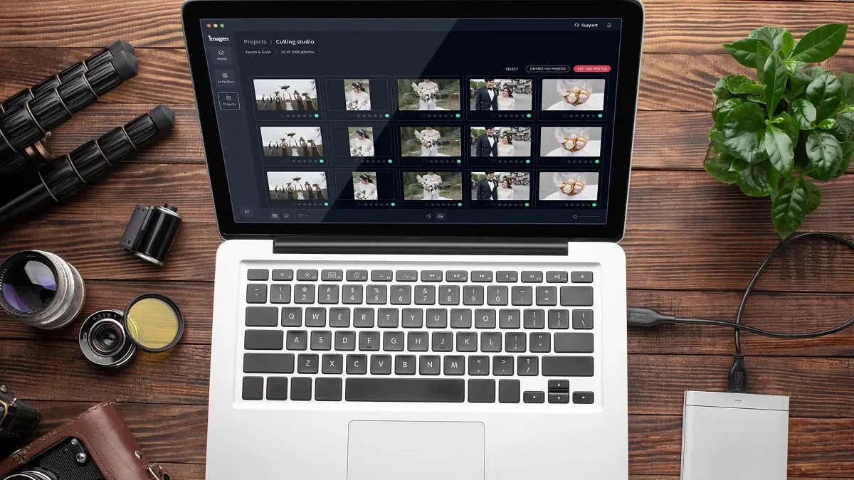
This is where an AI editing tool changes the math. Imagen is a desktop app for Mac and Windows, with the AI processing in the cloud, that learns your personal editing style from your past work and then applies that style across an entire shoot automatically. Instead of pasting a preset and hand-correcting every frame, you build a Personal AI Profile that captures how you handle white balance, exposure, contrast, and color, and Imagen carries that look consistently from the first frame to the last.
For food photographers who want to keep their signature grade while escaping the repetitive part of the job, Imagen’s AI food color correction software handles the consistency problem directly: it applies your grade across the full gallery, keeps whites and skin tones honest, and returns your edits in batches as they process, fast enough to turn a shoot around the same day. Because it works from your own edits rather than a generic filter, the result still looks like your photography, not a template. Pricing is straightforward pay on export: pay-as-you-go photographers pay for the photos they export, so the cost scales with the volume a busy food shoot produces. Sliders, crops, and masks you do yourself are always free.
It helps to be clear about what this kind of tool does and does not do. Batch color grading, culling, and shoot-wide consistency are exactly where an AI profile shines. Heavier work such as removing a stray crumb with precise compositing, or blending several bracketed exposures into a true high dynamic range merge, belongs to a dedicated retouching tool or a dedicated exposure-blending tool as a separate step. Grading gets your whole set to a finished, on-brand look; specialized fixes come after, on the few frames that need them.
A Repeatable Food Grading Checklist
To pull the workflow together, here is the order that keeps food grading fast and consistent. Set neutral white balance from a gray card first. Correct exposure and shape contrast before touching any color. Build your appetizing palette by adjusting hue, saturation, and luminance selectively. Apply your signature mood with restraint. Protect skin tones, whites, and backgrounds. Then carry that finished look across the entire shoot so every frame matches.
Run that sequence the same way every time and grading stops being guesswork. When the volume grows past what hand-editing can handle comfortably, lean on a batch tool to hold the consistency for you. You can start building a personal editing profile at the Imagen homepage and let the new Studio, where you cull, edit and export in one project, carry your look across the shoot while you get back to the camera.
What’s new in Imagen: Imagen is now an intelligent, agentic Studio for professional photographers, one project that holds your culling, editing, review and export in any order. For food shoots, a ready-made AI Profile can give you a starting grade while a Personal AI Profile learns your own look from past edits, and you can check early plates as edited photos arrive in batches. The Studio is rolling out gradually.
Frequently Asked Questions
What is the difference between color correction and color grading in food photography? Color correction is the technical step that makes the food look accurate, fixing white balance, exposure, and any color cast so the dish reads true to life. Color grading is the creative step on top of that, where you set a mood and a signature look, such as bright and airy or dark and moody. In practice you correct first, then grade.
Should I grade food photos in raw or JPEG? Always grade from raw when you can. A raw file holds the full color and tonal information straight off the sensor, so white balance and exposure stay fully adjustable without damaging the image. JPEG files bake those decisions in, which leaves far less room to recover highlights or shift color cleanly later.
How do I keep all the images in a food shoot looking consistent? Start with the same white balance and lighting logic across the set, grade one hero frame, and apply that look to the rest. For large galleries, a batch tool that learns your style and applies it automatically keeps the whole shoot matched far more reliably than pasting a preset and hand-tuning every frame, since your eye naturally drifts over a long session.
Can AI color grading match my personal editing style? Yes. Tools built on personal AI profiles learn from your own past edits rather than applying a generic filter, so the output reflects how you handle color and tone. That is what makes the result look like your photography while removing the repetitive, frame-by-frame part of the work.
