

How to Do Color Grading for Fashion Photographers: A Step-by-Step Guide
Table of contents
- Color correction versus color grading: know the difference
- Step 1: Set an accurate white balance
- Step 2: Fix exposure, contrast, and neutrals
- Step 3: Lock your skin tones
- Step 4: Build your signature grade
- Step 5: Apply the look consistently across the whole shoot
- How AI batch editing removes the consistency bottleneck
- Where a dedicated tool still earns its place
- A repeatable fashion grading checklist
- Frequently asked questions
Color grading in fashion photography is the deliberate work of shaping tone, hue, and contrast so that skin looks healthy, fabrics read true, and every frame in a story feels like it belongs to the same world. The step-by-step version is simple to state: start from a correct white balance, fix exposure and neutrals, lock the skin tones you want, build a signature look on top, and then apply that look consistently across the entire shoot. The craft lives in doing those steps in order and keeping them repeatable.
If you shoot editorials, lookbooks, or campaigns, the biggest challenge is rarely one hero image. It is holding a single mood across fifty or five hundred frames shot under shifting light. This guide walks through a practical grading workflow for fashion work, explains where photographers get stuck, and shows how AI batch editing removes the tedious part so you can spend your attention on the look itself.
Color correction versus color grading: know the difference
These two terms get used interchangeably, but they are separate jobs and they happen in a specific order. Color correction is technical. You neutralize color casts, set an accurate white balance, recover exposure, and make sure whites are white and blacks are black. The goal is a clean, faithful starting point where the model’s skin looks natural and the garment color matches what the client actually sold.
Color grading is creative. Once the image is correct, you push it toward a mood. That might be a warm golden editorial feel, a cool desaturated high-fashion look, or a punchy saturated pop for a streetwear brand. Grading is where your visual identity lives. If you grade before you correct, you are stacking a stylistic look on top of a technical error, and every fix afterward fights the look you already applied. Correct first, then grade. Always.
Step 1: Set an accurate white balance
White balance is the foundation of everything that follows. Shoot RAW so you keep full latitude to adjust temperature and tint after the fact without degrading the file. On set, a gray card or color checker photographed at the start of each lighting setup gives you a reliable neutral reference to click on later, which saves hours of guessing.
In fashion, watch for mixed lighting. A window plus a tungsten practical plus a strobe can leave three different color temperatures in one frame. Decide which light source should read as neutral, usually the key light on the model, and balance to that. Slightly warm skin tends to look more flattering than clinically neutral skin, so a small nudge toward warmth is a common and defensible choice.
Step 2: Fix exposure, contrast, and neutrals
With temperature set, balance the tonal range. Set your black point and white point so the image uses the full range without clipping detail out of a bright white blouse or crushing texture in a dark leather jacket. Fashion garments often carry the story in their texture, so protect highlight and shadow detail carefully.
Contrast controls mood. Higher contrast reads bold and graphic, which suits campaign and streetwear work. Lower, flatter contrast reads soft and premium, which suits beauty and luxury editorials. Set a base contrast now that matches the brief, because your creative grade will build on top of this tonal skeleton.
Step 3: Lock your skin tones
Skin is the one thing viewers judge instantly and unforgivingly. Before you get creative, make sure skin looks like living skin across the range of models in your shoot. Use the HSL or color mixer controls to steer the orange and red channels, adjusting hue, saturation, and luminance until skin reads natural rather than orange, gray, or plastic.
Fashion sets frequently include several models with different skin tones in the same series. A grade that flatters one may turn another sallow or ashy. Check each person individually and build small adjustments so everyone looks their best under the same overall look. This is the step where careful, image-by-image attention pays off the most, and it is worth slowing down for.
Step 4: Build your signature grade
Now the creative part. On top of a corrected, skin-accurate base, you shape the mood. The main tools are tone curves, color grading wheels, and split toning. A classic fashion move is to cool the shadows slightly and warm the highlights, which adds depth and a filmic quality without wrecking skin. Adjusting the individual red, green, and blue curves lets you tint shadows, midtones, and highlights independently for a refined, custom look.
Restraint separates a professional grade from a gimmick. A heavy teal-and-orange treatment can date an image fast and fight the garment colors the client needs to sell. Let the clothing and the brand’s identity guide the palette. If the collection is built on soft neutrals, an aggressive saturated grade actively hurts the work. Develop two or three signature looks you can reach for, and refine them over time into a recognizable style.
Step 5: Apply the look consistently across the whole shoot
This is where fashion color grading gets genuinely hard, and where most of the real hours disappear. A single striking frame is achievable for anyone. The professional standard is fifty polished frames for a lookbook, or hundreds for a full campaign, that all share the same mood, the same skin rendering, and the same contrast, even though they were shot across changing daylight, different setups, and multiple outfit changes.
Doing this by hand means grading a hero image, copying the settings, pasting them across the batch, and then manually correcting every frame where the light drifted. It is slow, it strains your eyes, and consistency slips as fatigue sets in near the end of a long edit. This bottleneck is exactly where modern AI editing changes the workflow.
How AI batch editing removes the consistency bottleneck
AI batch editing learns your personal grading style from your past edited images and then applies that style across an entire shoot automatically, holding tone and color consistent even when the lighting changed between frames. Instead of hand-pasting settings and fixing drift image by image, you feed in the full set and get back a batch already carrying your look, ready for a light final pass.
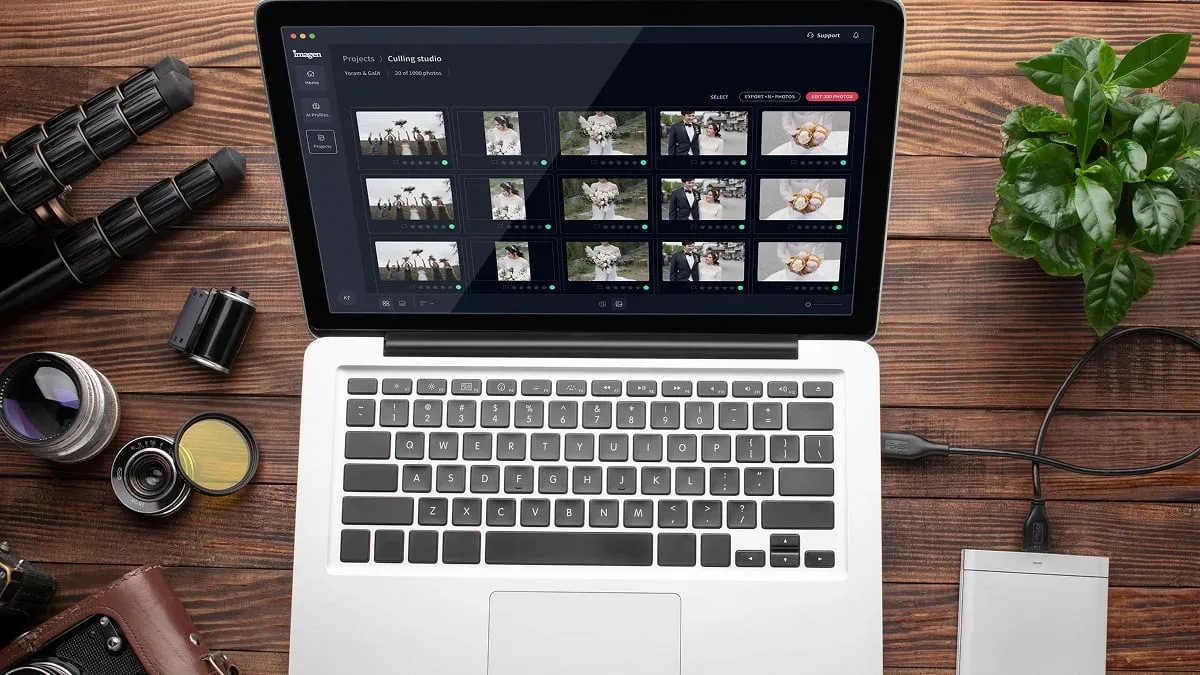
Imagen builds a Personal AI Profile from thousands of your own past edits, so the output reflects your taste rather than a generic filter. It is a desktop app for Mac and Windows with the AI processing in the cloud, works directly on RAW files, keeps color and tone consistent across a whole fashion shoot, and can also cull the weak frames before you grade, or you can cull by hand for free. For teams that need this specific job handled at scale, Imagen’s AI fashion color correction software is built to grade a full editorial or campaign to a single consistent look in a fraction of the manual time. Pricing is straightforward: exploring the tools is free, and pay-as-you-go photographers pay for what they export, so the cost scales cleanly whether you are editing a small lookbook or a season of campaigns.
The point is not to replace your eye. It is to move the repetitive, fatiguing part off your plate so your judgment goes into defining the look, not into pasting it five hundred times. You stay the art director; the tool handles the volume.
Where a dedicated tool still earns its place
Color grading is one part of a fashion retouching pipeline, and some tasks sit outside it. Heavy compositing, removing a stray light stand or a wrinkle in a seamless backdrop, and precise garment reshaping are object-level edits, not grading, and they belong in a dedicated retouching tool. The same is true for cleaning up motion blur or reducing heavy noise from a high-ISO frame, where a dedicated denoise and sharpening tool does the specialized work.
True exposure blending, where you merge several bracketed frames into one high dynamic range image, is also a separate step handled by a dedicated blending tool rather than a color grade. Keep these jobs mentally distinct. Grade for mood and consistency, then route the pixel-surgery tasks to the tools built for them, and your workflow stays clean and fast.
A repeatable fashion grading checklist
To keep results consistent from shoot to shoot, work the same sequence every time. Confirm you shot RAW and referenced a gray card. Set white balance to the key light. Fix exposure, black point, and white point. Balance contrast to the brief. Lock skin tones per model. Apply your signature grade on the corrected base. Then push the look across the full set and do a final per-frame check for any garment color that drifted. A written checklist taped to your monitor beats memory every time, especially at the end of a long edit.
For deeper dives, see our related guides on building a consistent editing style and speeding up client delivery. Consistency and speed are the two things fashion clients notice, and both come from a disciplined, repeatable process rather than heroic effort on one frame.
What’s new in Imagen: Imagen is now an intelligent, agentic Studio for professional photographers: one project where you cull, edit, review and export together. For fashion work, you can apply your Personal AI Profile or a ready-made AI Profile to a campaign, and more than one AI Profile can be applied to a selected set of photos, which takes some processing time. It is a beta, rolling out gradually to photographers.
Frequently asked questions
What is the difference between color correction and color grading in fashion photography? Color correction is the technical step that neutralizes color casts, sets accurate white balance, and fixes exposure so skin and fabric read true. Color grading is the creative step that shapes mood and builds your signature look on top of that corrected base. Correct first, then grade.
How do I keep skin tones consistent across different models in one shoot? Set an accurate white balance to your key light, then use the HSL or color mixer controls to steer the orange and red channels for each model individually. Different skin tones respond differently to the same grade, so check each person and make small per-model adjustments before applying your overall look.
How can I grade a large fashion shoot without spending days on it? Use AI batch editing that learns your personal style and applies it across the whole set automatically, holding color and tone consistent even when the light shifted between frames. This removes the slow hand-pasting and per-frame drift correction, leaving you a quick final review instead of a full manual grade.
Should I shoot RAW for color grading? Yes. RAW files retain the full color and tonal information, which gives you the latitude to adjust white balance, recover highlight and shadow detail, and grade aggressively without the file breaking down. Grading a compressed JPEG leaves far less room and shows banding much sooner.
Ready to grade a full shoot to one consistent look without the manual grind? Explore how Imagen’s AI photo editing, now a Studio where you cull, edit and export in one project, learns your style and edits a whole fashion series in a fraction of the time.
