

The Editing Consistency Checklist for Corporate Event Photographers Before Client Delivery
Table of contents
- Editing Consistency Checklist for Corporate Event Photographers Before Client Delivery
- Confirm color temperature matches across every room and lighting setup
- Match skin tones consistently across every subject and session
- Check exposure consistency across bursts and camera bodies
- Verify brand color accuracy for logos, backdrops, and signage
- Audit crop and composition consistency for headshots and group shots
- Cull duplicates and pick the strongest frame per moment
- Check white balance consistency between indoor and outdoor segments
- Review edit consistency shoot to shoot for repeat corporate clients
- Run a final side by side comparison before client delivery
- Frequently asked questions
Editing Consistency Checklist for Corporate Event Photographers Before Client Delivery
An editing consistency checklist for corporate event photographers means verifying, before delivery, that color temperature, skin tones, exposure, brand colors, and crop style all match across every room, every session, and every shooter on the job. Corporate clients notice inconsistency fast because their gallery gets compared side by side on a company intranet or a LinkedIn recap post, so a headshot that looks warmer than the one next to it, or a stage shot with a different white balance than the mingling shots, reads as sloppy even when each individual photo is technically fine.
The fastest way to catch these gaps is a repeatable pass through nine checkpoints: lighting and color temperature, skin tone, exposure, brand color accuracy, crop and composition, duplicate culling, indoor to outdoor white balance shifts, shoot to shoot consistency for repeat clients, and a final side by side review. Work through them in order on a full-resolution grid view, not thumbnails, and flag anything that breaks the pattern before it reaches the client folder.
Confirm color temperature matches across every room and lighting setup
Corporate events rarely happen in one lighting condition. A keynote stage might run on tungsten spotlights, the networking reception sits under mixed fluorescent and window light, and the step and repeat backdrop has its own flash setup. Pull a grid of thumbnails from each location side by side and check whether the color temperature drifts warm in one room and cool in another. If your camera’s auto white balance handled each room differently, that drift will show up as an obvious color shift once a client scrolls through the full gallery in order.
Set a target Kelvin value for the whole event based on the dominant light source, then adjust outlier shots to sit within a tight range of that target rather than correcting each photo in isolation. A small, deliberate variance is fine. An unplanned swing from 3200K to 5600K between two adjacent images in the same gallery is not.
Match skin tones consistently across every subject and session
Skin tone consistency is one of the first things a corporate client’s marketing or HR team will flag, especially on employee headshots meant for a directory or website. Compare portraits taken under the same light for even rendering across different skin tones, and check that no single subject looks noticeably more orange, red, or desaturated than the others in the same set. This matters even more when a headshot session spans several hours, since natural light shifts and flash output can drift slightly as batteries drain or clouds move.
Build a reference strip of five or six representative headshots and eyeball them together before finalizing the batch. If one subject’s tone breaks the pattern, it usually means an individual exposure or white balance error rather than a global setting problem, so fix it as an exception rather than reworking the whole set.
Check exposure consistency across bursts and camera bodies
Corporate events often involve more than one shooter, or a single shooter switching between two bodies to cover a stage and a floor at the same time. Exposure drift between camera bodies is common because sensors and metering behave slightly differently even within the same brand and model line. Scan through the gallery in sequence and look for jumps in brightness that do not match a real change in the scene, particularly at the seams where footage from one camera hands off to another.
A useful habit is grading in small batches organized by camera and lighting condition rather than working straight down one long timeline. That groups similar exposure problems together so you fix them once instead of chasing the same correction across scattered frames.
Verify brand color accuracy for logos, backdrops, and signage
Corporate clients care about their brand colors landing correctly far more than the average portrait client does. A backdrop or podium sign in the wrong shade of blue, or a logo that reads slightly green because of a color cast, is the kind of detail a brand or marketing lead will catch immediately. Where possible, get the client’s hex codes or brand guidelines ahead of the shoot, and check finished images against a color reference rather than relying on memory or a monitor that may not be calibrated.
Pay particular attention to any shot where a branded element sits close to a colored light source, since ambient color casts are easiest to introduce right around logos and signage without noticing during a fast edit pass.
Audit crop and composition consistency for headshots and group shots
When a corporate gallery includes dozens of individual headshots meant for the same directory grid, inconsistent cropping stands out immediately once they are placed next to each other on a page. Check that head size, framing distance, and horizon level stay consistent across the full headshot set, and that group shots follow a similar composition pattern rather than switching aspect ratios or crop styles halfway through.
This is also where it helps to decide the crop ratio before editing begins, based on how the client plans to use the images, whether that is a square directory grid, a widescreen website banner, or a vertical social post, so you are not re-cropping the same batch twice.
Cull duplicates and pick the strongest frame per moment
Culling is where editing consistency starts, not an afterthought once editing is done. Every handshake, award presentation, or candid networking moment usually produces a burst of near-identical frames, and selecting a different quality bar for each burst is how inconsistent expressions, blinks, and framing slip through. Set a clear standard for what counts as the keeper frame, generally the sharpest image with the best expression and cleanest background, and apply it the same way across the whole event rather than loosening the bar as fatigue sets in during a long culling session.
A tighter, more consistent cull also makes every later step faster, since fewer near-duplicate frames means less chance of accidentally delivering two versions of the same moment with slightly different edits.
Check white balance consistency between indoor and outdoor segments
Corporate events frequently move between an indoor conference hall and an outdoor courtyard, terrace, or step and repeat area. Each transition is a common place for white balance mismatches to creep in, since the color temperature outdoors can swing dramatically depending on time of day and cloud cover. Review the images that bridge each transition specifically, not just the bulk of shots within a single location, because that is where a client’s eye naturally jumps if the gallery is viewed in chronological order.
Review edit consistency shoot to shoot for repeat corporate clients
Many corporate clients book the same photographer for quarterly town halls, annual conferences, or a recurring headshot refresh, and they expect this year’s gallery to look like last year’s in terms of tone and style, even though the venue, lighting, and season have all changed. Keep a reference set of finished images from prior shoots for that client and compare new edits against it before delivery, checking for drift in warmth, contrast, or saturation that may have crept in gradually across projects.
This is the point in the workflow where Imagen’s AI style profile earns its keep. Once you train a profile on the look you want, Imagen’s consistent AI batch editing applies that same color and tone treatment across an entire shoot, and across the next one, so a returning client’s gallery matches their prior year’s edit style without you manually rebuilding presets each time. It also runs AI culling on the front end, so the strongest frame per moment gets selected the same way every time rather than depending on how tired you are by the two thousandth image. For photographers running this checklist against a growing roster of repeat corporate clients, Imagen’s AI style profile tool is built specifically to keep that look locked in from one event to the next. With pay as you go pricing you pay for what you export, and exploring the tools is free, so you can try everything on a full event gallery first and budget around what actually leaves Imagen.
Run a final side by side comparison before client delivery
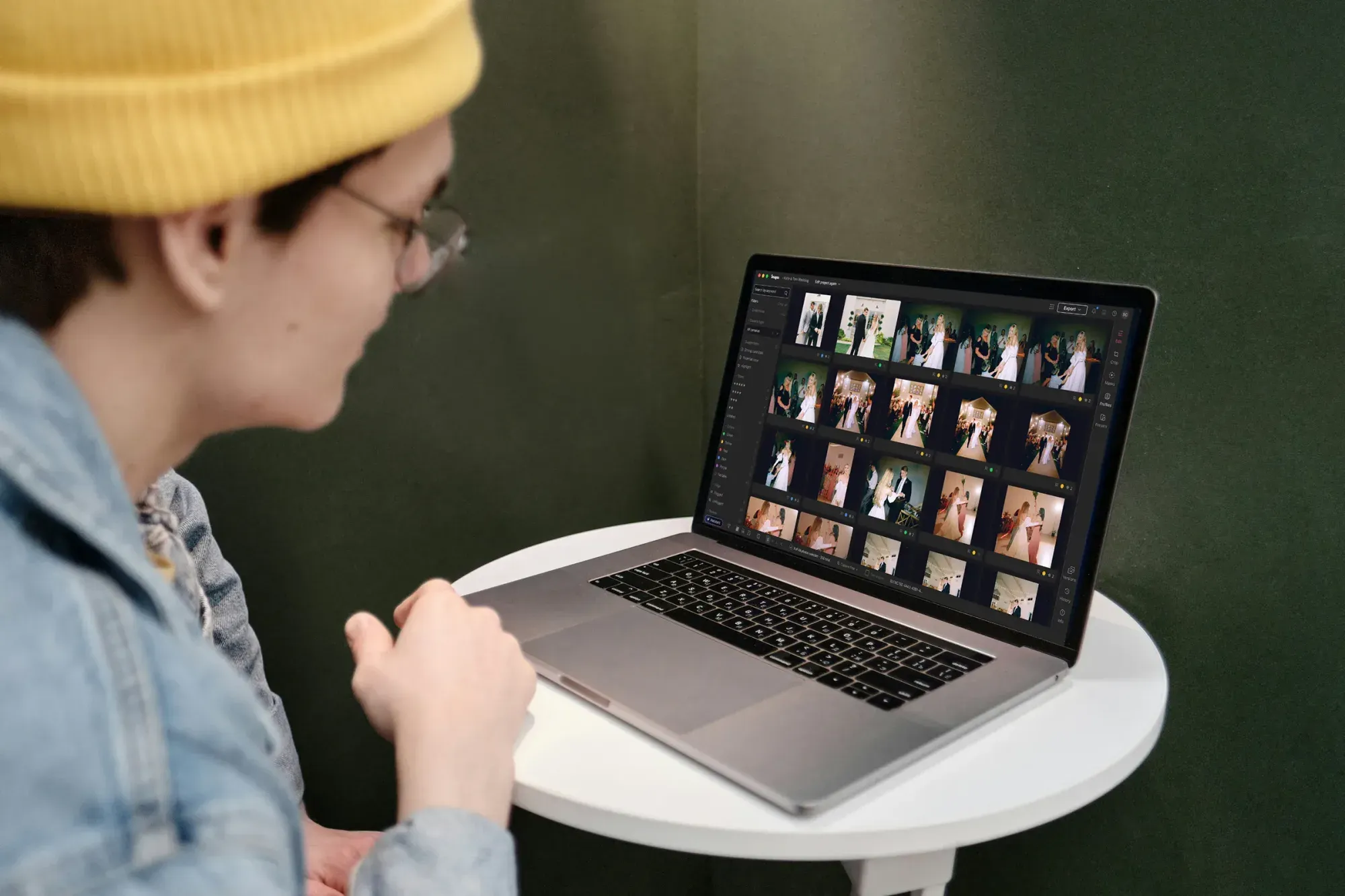
Before the gallery goes out, do one last pass with the images laid out in a grid rather than scrolling one at a time. Full timeline scrolling is good for catching individual mistakes, but a grid view is what actually reveals inconsistency, since your eye can compare five or six frames at once the same way a client will when they open the delivered folder. Look specifically for the outliers that survived your earlier passes: one warm frame in a cool sequence, one crop that does not match its neighbors, one skin tone that reads differently than the rest.
If you catch a genuine technical issue during this pass, such as a soft or blurred frame that slipped past culling, that is a job for a dedicated sharpening or noise reduction tool rather than a batch color edit, since those corrections need individual attention. The same goes for any shot that needs geometry or perspective correction from an awkward stage angle, or a true HDR merge from bracketed exposures in a high contrast ballroom, both of which are separate specialist steps rather than something a consistency pass should try to solve.
Once the grid looks clean, package the gallery and send it. If you are still building out your general workflow and want a broader look at how AI-assisted editing fits into a corporate event pipeline, the Imagen homepage walks through the full picture of the new Studio, where you cull, edit and export in one project.
What’s new in Imagen: Imagen has grown into an intelligent, agentic Studio for professional photographers, where culling, editing, review and export share one project and can happen in any order. AI filters such as blur and closed eyes help you narrow an event shoot, and you can use AI culling or cull manually for free. The Studio is rolling out gradually as a beta.
Frequently asked questions
How long should an editing consistency check take for a full corporate event gallery? For a gallery in the 500 to 1,500 image range, budget 30 to 60 minutes for a dedicated consistency pass separate from the main edit, done in grid view rather than one image at a time. Larger multi-day conferences with several thousand images may need this pass broken into segments by day or location.
What is the most common consistency mistake in corporate event editing? Color temperature drift between rooms or lighting setups is the most frequent issue, followed closely by crop inconsistency across headshot sets meant for a directory grid. Both are easy to miss when editing sequentially and easy to catch once images are compared side by side.
Should skin tone edits be applied globally or per subject? Start with a global adjustment tuned to the dominant lighting condition, then handle individual subjects as exceptions rather than re-grading everyone from scratch. This keeps the overall gallery consistent while still correcting genuine outliers.
How do repeat corporate clients expect year over year consistency to work? Most expect this year’s headshots or event gallery to feel like a continuation of prior years rather than a visible style change, even though lighting, venue, and season differ. Keeping a reference set from previous shoots, or using a saved AI style profile, is the most reliable way to meet that expectation without manually rebuilding your edit from memory each time.
