

Contrast in Photography: Types and How to Use It (2026)
Table of contents
- What Contrast Actually Means in a Photograph
- Tonal Contrast: Light Against Dark
- Color Contrast: Hue, Saturation, and Temperature
- Textural Contrast: Smooth Against Rough
- How to Control Contrast in the Camera
- How to Control Contrast in the Edit
- Keeping Contrast Consistent Across a Whole Shoot
- Common Contrast Mistakes to Avoid
- Bringing It All Together
- Frequently Asked Questions
Contrast in photography is the difference between the light and dark areas, the colors, and the textures in a frame, and it is one of the strongest tools you have for guiding a viewer’s eye. When you understand contrast, you stop treating it as a slider you nudge at the end and start seeing it as a decision you make the moment you compose. This guide breaks contrast into its main types, shows how to control each one in the camera and in the edit, and explains how to keep a whole shoot looking consistent when you are working through hundreds of frames.
Whether you shoot moody portraits, bright product images, or sprawling landscapes, the same principles apply. Learn to read contrast, learn to shape it, and your images gain depth, mood, and a clear focal point without any gimmicks.
What Contrast Actually Means in a Photograph
At its simplest, contrast is difference. A photograph with high contrast has bright highlights sitting next to deep shadows, with fewer midtones in between. A low-contrast photograph keeps most of its tones in a narrow band, which reads as soft, flat, or airy depending on where those tones fall. Neither is better on its own. A high-contrast black-and-white street scene and a low-contrast pastel newborn portrait are both correct for what they are trying to say.
The reason contrast matters so much is that human vision is drawn to edges and differences. Your eye lands on the spot where dark meets light, where a warm color interrupts a cool field, or where a sharp texture breaks a smooth one. Control those differences and you control attention. That is the whole game, and every type of contrast below is just a different lever for the same effect.
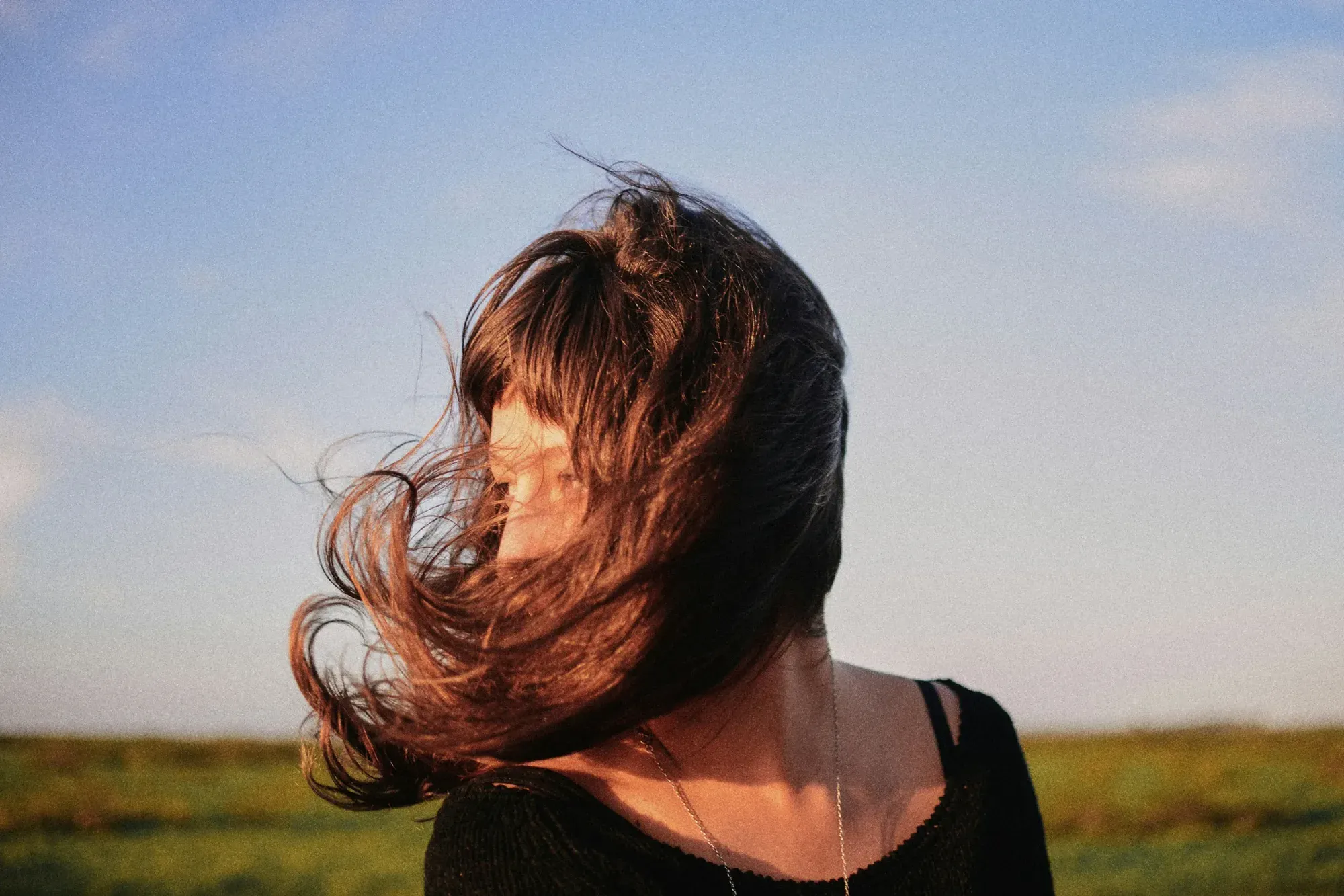
Tonal Contrast: Light Against Dark
Tonal contrast is the one most people mean when they say contrast. It is the range from the brightest highlight to the darkest shadow. You shape it first with light. Hard light from a small or distant source, like midday sun or a bare flash, creates crisp shadow edges and a wide tonal range. Soft light from a large or diffused source, like an overcast sky or a big window, compresses the range and produces gentle gradations.
In the camera, your exposure and your light direction do most of the work. Side light rakes across a subject and reveals form through shadow, which raises tonal contrast. Front light fills those shadows and lowers it. Once you are editing, the tone curve is your main instrument. Steepening the curve in the middle pushes highlights brighter and shadows darker for a punchier look, while flattening it lifts the shadows and pulls the highlights down for a softer, more filmic feel. If you want to go deeper on shaping shadow density and mood, our guide to shadow photography covers how to read and place shadows deliberately.
Color Contrast: Hue, Saturation, and Temperature
Color contrast comes from the relationship between hues rather than between light and dark. The classic example is complementary contrast, where colors sitting opposite each other on the color wheel, such as orange and blue or red and green, create a strong visual pop when placed side by side. This is why a warm subject against a cool background reads so cleanly, and why teal and orange grading became a cinema staple.
There are subtler forms too. Warm-to-cool contrast plays a sunlit foreground against a shaded background. Saturation contrast places one vivid element against a muted field, so a single red umbrella in a gray city instantly becomes the subject. Value contrast within color, meaning a light hue against a dark hue, can carry an image even when the hues themselves are close. In editing, you control color contrast through white balance, HSL adjustments, and color grading in the shadows and highlights. Nudging the shadows cooler and the highlights warmer is one of the most reliable ways to add depth without touching a single tone curve.
Textural Contrast: Smooth Against Rough
Textural contrast is the difference in surface detail across a frame. A smooth, blurred background behind a sharply rendered subject is textural contrast at work, and it is why a wide aperture feels so effective for portraits. Rough bark against soft skin, a crisp fabric weave against a hazy backdrop, or water blurred by a long exposure against sharp rock all use the same principle. The eye reads the detailed area as important and the smooth area as supporting.
You build textural contrast mainly in the camera through aperture, focus, and shutter speed. A shallow depth of field separates a sharp subject from a soft surround. A slow shutter smooths moving water or clouds while static elements stay crisp. Directional light also amplifies texture, because raking light across a rough surface deepens the tiny shadows that define it. In the edit, clarity, texture, and sharpening tools let you emphasize detail selectively, adding bite to the subject while leaving smooth areas alone.
How to Control Contrast in the Camera
The best contrast decisions happen before you press the shutter, because you have far more information to work with. Start with light quality and direction, since they set your tonal range. Choose your time of day deliberately. The low, warm light near sunrise and sunset gives long shadows and strong tonal and color contrast, while the flat light of an overcast midday gives you a soft, even canvas you can shape later.
Expose to protect the tones that matter. If you are after rich, punchy contrast, expose for the highlights and let the shadows fall, keeping detail where you want the viewer to look. If you want a gentle, low-contrast rendering, expose to keep everything in the middle of the histogram and avoid clipping at either end. Shooting in RAW gives you the widest latitude to raise or lower contrast afterward without the file falling apart. If your goal is a bold, graphic look with deep blacks and bright whites, our dedicated walkthrough on high-contrast photography shows how to plan and light for it from the start.
How to Control Contrast in the Edit
Editing is where you refine what the camera captured, and it pays to work from broad to specific. Begin with the tone curve to set overall tonal contrast, then use the black and white points to anchor your darkest and lightest values. From there, move to local adjustments. Dodging and burning, radial and linear masks, and range masks let you raise contrast exactly where the subject sits and calm it everywhere else, which keeps the viewer’s eye locked on target.
Color contrast comes next. Adjust white balance for the overall warm-to-cool relationship, then use HSL and split toning or color grading to separate your subject from the background by hue. Finish with texture and clarity for micro-contrast, applied with restraint so skin and smooth surfaces do not turn gritty. The order matters because global moves change how local ones read, and jumping straight to clarity before you have set your tone curve usually means redoing work.
Keeping Contrast Consistent Across a Whole Shoot
Controlling contrast in one hero image is one thing. Keeping it consistent across four hundred frames from a wedding, an event, or a full property listing is another, and it is where a lot of editing time disappears. A ceremony shot in open shade, a reception under warm tungsten, and a portrait in direct sun all need different contrast handling to end up looking like one coherent gallery rather than a patchwork.
Imagen is a desktop app for Mac and Windows built for exactly this problem, and its new Studio lets you cull, edit and export in one project. It applies your personal AI editing style, your Personal AI Profile, including your tonal and color contrast choices, across an entire shoot, so the whole set carries one look instead of drifting frame to frame. AI culling narrows down near-identical bursts first, and the AI Assistant handles per-photo finishing such as object removal and background blur on the frames that need extra care. The first batch finishes in under 10 minutes, which is the difference between grading tonight and grading all weekend.
Pricing is pay-as-you-go: you pay for the photos you export, and exploring the tools is free. It is worth being clear about the boundaries too. Imagen grades, culls, and finishes what your camera actually recorded, and it does not sharpen or deblur a soft capture, so contrast and consistency are its lane rather than rescuing missed focus.
Common Contrast Mistakes to Avoid
The most frequent mistake is overcooking global contrast until the shadows block up into featureless black and the highlights blow out to paper white. Detail you can never recover is gone the moment you clip it, so watch your histogram and pull back before the ends stack up. The second common error is applying the same heavy contrast to every genre. A newborn session and a rock band promo do not want the same curve, and matching contrast to the subject’s mood is more important than any preset.
A third mistake is ignoring color contrast entirely and leaning only on tone. Two subjects can have identical brightness yet separate beautifully through hue, and remembering that opens up compositions that flat tonal thinking would miss. Finally, avoid uneven contrast across a set. If half your gallery is punchy and half is soft with no intent behind it, the work reads as inconsistent rather than stylish, which is exactly the problem a consistent batch grade solves.
Bringing It All Together
Contrast is not a single slider. It is tonal, color, and textural difference working together to give an image depth and direction. Decide the mood you want, shape the light and exposure in the camera to serve it, refine tone and color in the edit from broad to specific, and then hold that look steady across every frame you deliver. Do that and your images gain a clear point of focus and a consistent voice, which is what separates a polished body of work from a pile of individually decent photos.
For more on the topics above, see our companion guides on high-contrast photography and shadow photography, and browse the full library of photography workflow tips for more on editing, culling, and consistent finishing.
What’s new in Imagen: Imagen is now an intelligent, agentic Studio for professional photographers, one project where you cull, edit, review and export in any order. To hold contrast steady across a shoot, apply your Personal AI Profile, then fine tune single frames in the built-in editor (Beta), which has manual sliders and a histogram. The Studio is rolling out gradually as a beta.
Frequently Asked Questions
What are the main types of contrast in photography?
The three main types are tonal contrast, which is the difference between light and dark areas, color contrast, which comes from the relationship between hues and their saturation and temperature, and textural contrast, which is the difference between smooth and detailed surfaces. Most strong images use two or three of these together to create depth and a clear focal point.
How do I increase contrast without losing detail?
Work from broad to specific and watch your histogram. Set overall tonal contrast with the tone curve, then use local masks to add contrast only where your subject sits rather than globally. Stop before the shadows clip to pure black or the highlights blow to pure white, because any detail lost at those extremes cannot be recovered. Shooting in RAW gives you the most latitude to push contrast safely.
Is high contrast or low contrast better?
Neither is better on its own, because contrast should match the mood of the image. High contrast suits bold, graphic, or dramatic work with strong shadows, while low contrast suits soft, airy, or gentle subjects like newborns or pastel scenes. The right choice depends on what you want the photograph to say, not on a fixed rule.
How do I keep contrast consistent across a large shoot?
Batch editing tools let you apply one consistent style, including your tonal and color contrast, across an entire set at once. Imagen’s Personal AI Profile does this across a whole shoot so images taken in different light end up looking like one coherent gallery, with the first batch finishing in under 10 minutes. If one frame still needs a manual nudge, the built-in editor (Beta) offers sliders and a histogram. This removes the frame-by-frame drift that makes a gallery look inconsistent.
Can editing software fix a photo that is too flat?
Yes, within limits. If you shot in RAW and protected your tones, you can raise both tonal and color contrast in editing using the tone curve, local masks, and color grading to give a flat file depth. What editing cannot do is invent detail that was clipped away or restore focus that was never captured, so getting exposure and light right in the camera still gives you the best starting point.
