

9 Color Grading Tips for Automotive Photographers
Table of contents
- 1. Lock white balance to the paint, not the scene
- 2. Protect chrome, glass, and reflective trim
- 3. Build one look, then apply it across the whole shoot
- 4. Match color and exposure across an inventory batch
- 5. Grade paint colors that fight you: reds, blacks, and whites
- 6. Separate the car from the background with tone, not tricks
- 7. Handle mixed and difficult light without chasing your tail
- 8. Calibrate your monitor and set a viewing standard
- 9. Systematize delivery so consistency scales
- How Imagen fits an automotive photographer’s workflow
- Frequently asked questions
Great automotive color grading comes down to three things that are harder than they look: getting the paint color exactly right, keeping chrome and glass reflections clean, and making every car in a gallery or a dealership inventory look like it was shot on the same day. If your reds drift orange, your blues go purple, or one SUV looks warmer than the one parked next to it, the grade fights you instead of selling the car. The fastest way to fix that is to nail white balance and paint accuracy at capture, then apply a consistent, repeatable look across the whole set.
The tips below walk through a practical grading workflow for cars, from calibrating your reference to protecting reflections and delivering a matched inventory batch. They apply whether you shoot showroom studio sets, rolling exteriors at golden hour, or a hundred used cars a week for an online listing. At the end, we cover how a batch editing tool removes the repetitive part so you spend your time on the shots that need a real eye.
1. Lock white balance to the paint, not the scene
Automotive paint is a color reference in its own right, and buyers notice when it is wrong. A candy red that reads brick, or a factory silver that turns green under shade, breaks trust before anyone reads the listing. Shoot a gray card or a color checker in the same light as the car, set a custom white balance from it, and treat that as your anchor for the whole session. When the light changes, for example when clouds roll in or you move from a lit bay to an open lot, pull a fresh reference rather than eyeballing the temperature slider.
For factory colors, keep a small note of the manufacturer paint code and how it should render. Metallics and pearls shift with viewing angle, so grade the largest clean panel, usually a door or the hood, and let the rest follow. Getting the base neutral right first means your creative grade sits on top of an accurate foundation instead of correcting two problems at once.
2. Protect chrome, glass, and reflective trim
Chrome and polished trim are just mirrors, so they carry the color of whatever they reflect. Push global saturation too hard and the chrome picks up a color cast, the glass goes muddy, and the car looks cheap. Grade with reflections in mind: keep highlights in chrome close to neutral, let glass hold a believable sky or environment tone, and avoid clipping the specular hits that give metal its shine.
A useful habit is to check the brightest reflections after every major adjustment. If your contrast move blows out the chrome or crushes the reflection detail in the windshield, dial it back or mask the effect away from those areas. Reflective surfaces are where sloppy grading shows first, and they are the hardest thing to fake later.
3. Build one look, then apply it across the whole shoot
Consistency is what separates a professional gallery from a folder of one-off edits. Decide on your look early: contrast curve, color balance in shadows and highlights, and how warm or cool the overall image should feel. Bake that into a preset or a profile, then apply it to every frame so the walkaround images, the detail shots, and the hero exterior all belong together.
This matters even more for dealership and marketplace work, where a single listing might have twenty photos. If the front three-quarter is warm and the interior is cool, the eye reads the car as two different vehicles. One look, applied evenly, keeps the set coherent and lets the car do the talking.
4. Match color and exposure across an inventory batch
Inventory shooters live and die by consistency across cars, not just within one car. When you photograph fifty vehicles in the same bay, the goal is that a black sedan and a white crossover both look like they were graded by the same hand: same background tone, same brightness, same neutral base. Shoot to a fixed lighting setup and a locked reference so every car starts from the same place, then apply a shared grade on top.
Where possible, standardize the parts of the frame that are not the car, such as the floor, the backdrop, and the ambient fill. A consistent environment makes a consistent grade far easier, and it means a buyer scrolling an inventory page sees a clean, uniform set instead of a patchwork. This is also the stage where a batch tool earns its keep, since matching color and tone by hand across dozens of cars is slow and error prone.
5. Grade paint colors that fight you: reds, blacks, and whites
Certain finishes are notorious. Reds tend to oversaturate and lose panel detail, so pull saturation back on the red channel and watch for clipping where the sun hits the fender. Black cars are really a study in reflections and subtle tone, so protect the shadow detail and let the highlights describe the body shape instead of grading the paint toward pure black. White and silver cars blow out easily, so hold the highlights and add a touch of tone so the panels do not read as flat paper.
For each of these, judge the result against your neutral reference, not against your memory of the color. Screens vary, ambient light in your editing room varies, and paint is one of the few subjects where a buyer will compare your photo to the real thing.
6. Separate the car from the background with tone, not tricks
A clean grade helps the vehicle sit forward in the frame. You can guide the eye with a gentle contrast difference between the car and its surroundings, slightly warmer or brighter on the subject and calmer behind it. Keep this subtle. Heavy vignettes and aggressive local dodging read as amateur and distract from the paint you worked hard to get right.
If a shoot genuinely needs the background removed or replaced, for example dropping a car onto a clean studio sweep, treat that as a separate compositing step with a dedicated background tool rather than something to force with the grade. Color grading and heavy compositing are different jobs, and mixing them usually costs you time on both.
7. Handle mixed and difficult light without chasing your tail
Outdoor automotive work rarely gives you clean light. You get open shade on one panel and direct sun on another, or sodium and LED fixtures mixing in a covered lot. Rather than fighting each frame, grade for the dominant light and correct the reference in camera when you can. If two light sources are truly fighting, decide which one owns the car and neutralize to that, then let the secondary source fall where it may.
For very high contrast scenes, capture enough exposure range to hold both the bright sky reflection and the shadowed underside. If you need to merge multiple exposures into one file, that bracket-merging step belongs to a dedicated exposure-blending tool before you grade, so you are grading a single clean image rather than wrestling blown highlights back from nothing.
8. Calibrate your monitor and set a viewing standard
None of these tips survive an uncalibrated screen. If your monitor runs warm, you will grade every car cool to compensate, and it will look wrong everywhere else. Calibrate your display on a regular schedule, edit in a room with stable, neutral light, and give your eyes a fixed white reference to return to. For paint especially, an accurate screen is the difference between a grade that matches the real car and one that only looks right on your desk.
It also helps to spot check a graded image on a second device, such as a phone, since that is where many buyers will actually see it. If the paint holds up across screens, your neutral base and your look are both doing their job.
9. Systematize delivery so consistency scales
The last tip is about the workflow around the grade. If every car is a fresh manual edit, consistency depends on your patience at eleven at night, which is a fragile thing. Build a repeatable pipeline: a fixed capture setup, a locked color reference, a defined look, and a batch process that applies that look to the entire set at once. Then reserve your manual attention for the handful of frames that need it, such as a tricky reflection or a hero shot for the top of the listing.
This is where an AI batch editing tool changes the math. Imagen learns your personal editing style from your past work, builds an AI profile from it, and then applies that style, including your color and tone decisions, consistently across an entire shoot in the cloud. It culls, it works from your RAW files, and it sends edited photos back in batches as they process so you can start reviewing a matched set early, which is exactly the repetitive, consistency-critical part of automotive work that eats your evenings. Pricing is straightforward: pay as you go is a monthly base fee plus a charge for the photos you export, so the cost scales cleanly whether you edit one car or a full week of inventory.
If a chunk of your automotive work is video, for instance walkaround reels, rolling footage, or social clips of the same cars you photograph, Imagen’s AI color grading software for automotive video creators extends the same idea to footage. It grades clip by clip and hands off to an Assistant Editor that opens in Premiere, so your stills and your video keep a consistent look. The first project is free, and video grading is priced per project rather than per image, so it fits naturally alongside a photo pipeline without changing how you charge for stills.
How Imagen fits an automotive photographer’s workflow
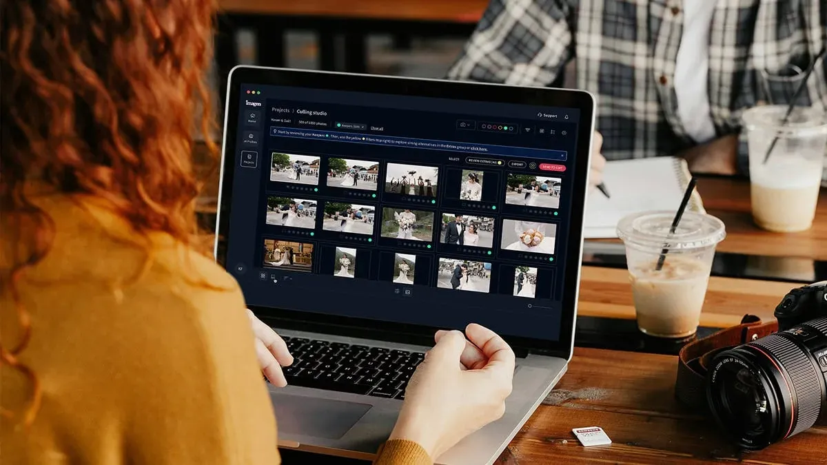
The tips above are about judgment: reading paint, protecting reflections, and deciding on a look. None of that goes away. What Imagen removes is the manual repetition of applying that judgment to every single frame, which is where inventory and event automotive shooters lose the most time. You define the style once through your profile, and the tool carries it across the batch with the color and tone consistency these tips call for. When you are ready to try it on a real set, you can start at the Imagen homepage and run Imagen’s new Studio, where you cull, edit and export in one project, against your own RAW files.
For deeper dives, see our related guides on valuable editing tips for building a consistent gallery and speeding up client delivery. Grading cars well is a craft; scaling that craft across a whole inventory is a workflow problem, and the two solve best together.
What’s new in Imagen: Imagen is now an intelligent, agentic Studio for professional photographers, one project where you cull, edit, review and export in any order. For a dealership or event shoot, ask the assistant in plain language to find every interior shot, then act on that selection with Imagen’s tools while you steer the result. Edited photos arrive in batches as they process. The Studio is rolling out gradually as a beta.
Frequently asked questions
How do I keep paint color accurate when I grade car photos? Start by locking white balance to a physical reference, such as a gray card or color checker shot in the same light as the car, and grade the largest clean panel first. Correct the neutral base before you apply any creative look, and always judge the result against that reference rather than from memory, since buyers compare your photo to the real vehicle.
Why do chrome and glass look wrong after grading? Chrome, glass, and polished trim act like mirrors, so they carry whatever color and brightness sit around them. Pushing global saturation or contrast too far gives them a color cast or crushes reflection detail. Keep chrome highlights close to neutral, protect the specular hits, and check your brightest reflections after every major adjustment.
How do I make a whole dealership inventory look consistent? Use a fixed lighting setup and a locked color reference so every car starts from the same neutral base, standardize the background and floor tone, then apply one shared look across the entire batch. Grading each car by hand invites drift, so a batch editing tool that applies your style uniformly is the reliable way to match color and exposure across many vehicles.
Can I use the same look for my automotive photos and videos? Yes. Build your look once as a photo grade, then extend it to footage so walkarounds and reels match your stills. Imagen’s video color grading works clip by clip and hands off to an Assistant Editor in Premiere, which keeps a consistent look across both formats while you continue to grade photos in the same ecosystem.
