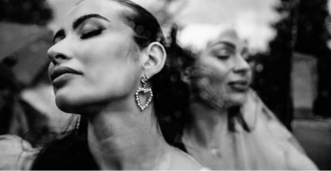
Black and white photography is timeless. When you strip away color, you are left with the building blocks of a powerful image: emotion, light, shadow, texture, and form. But as any professional photographer knows, creating a stunning black and white photo is not as simple as clicking a “desaturate” button. It is an art of re-interpretation. For years, we have relied on Lightroom presets as a shortcut, but they often create more work than they save.
This guide is for the working photographer. We will explore the fundamentals of black and white conversion in Lightroom, the limits of traditional presets, and how new AI-powered tools like Imagen are revolutionizing our monochrome workflow.
Key Takeaways
- Beyond Desaturation: A great black and white image is not just a color photo with the color removed. It requires careful adjustment of the relationships between the original colors using tools like the B&W Mixer.
- The Preset Problem: Traditional Lightroom presets are static. They apply the same set of slider adjustments to every photo, regardless of the lighting, subject, or composition.
- The B&W Mixer is Your Best Tool: The B&W Mixer panel in Lightroom is the most important tool for monochrome editing. It allows you to control the brightness of the original colors in the final black and white image.
- AI is the New Preset: Imagen‘s AI Profiles are dynamic. Instead of applying one static look, they analyze each photo individually and edit it according to a learned style.
- Build Your Own Editor: An Imagen Personal AI Profile learns from your own edited photos. You can create a dedicated B&W profile that understands how you edit skin, skies, and foliage, and then applies that knowledge to entire galleries in minutes.
The Allure and Challenge of Black and White
Why do we still love monochrome images in a world full of color? Because color can be a distraction. A bright red shirt can pull your eye away from the subject’s expression. Clashing background colors can make a scene feel chaotic.
Black and white photography removes that chaos. It forces the viewer to see the world differently.
- Emotion: Without color, subtle expressions and gestures become the main focus.
- Texture: The rough bark of a tree, the wrinkles on a face, or the smooth surface of water become more pronounced.
- Light & Shadow (Chiaroscuro): This is the heart of B&W. The interplay between light and dark becomes the subject itself.
- Form & Shape: The outline of a mountain against the sky or the curve of a portrait subject’s shoulder is emphasized.
The core challenge is this: Your camera captures the world in color. When you convert to B&W, two very different colors might turn into the exact same shade of gray. Think of a red flower against green leaves. In B&W, they could blend together into a “muddy” mess.
Our job as editors is not to remove color, but to translate it. We must decide how bright or dark that red flower and those green leaves should be in the final image. This is where presets come in, for better or worse.
What Are Lightroom Presets (And Where Do They Fall Short)?
Let’s be clear about what a preset is. A traditional Lightroom preset is simply a saved set of slider positions. It records your adjustments for Exposure, Contrast, the B&W Mixer, the Tone Curve, and more, and then applies those exact same settings to any photo you click.
The Good
I have used presets for years, and they have their place.
- Speed (Sometimes): They can give you a “one-click” look that gets you 70% of the way there.
- Consistency (In Theory): They can help you apply a similar starting point across a set of images.
- Learning: For beginners, deconstructing a preset is a great way to learn how different sliders interact.
The Bad (The “Preset Problem”)
Here is the professional’s dilemma, and the reason I’ve largely moved beyond them. Presets are static and dumb.
A preset has no idea what is in your photo. It doesn’t know if it’s a portrait or a landscape. It doesn’t know if it was shot at noon or during golden hour. It just applies the same numbers, every single time.
Have you ever experienced this?
- You buy a “Dark & Moody B&W” preset pack.
- You apply it to your photo of a couple in a bright, sunny field. The photo looks amazing, just like the preview!
- You then apply that same preset to a photo from the same shoot, but this time indoors by a window.
- The result is a disaster. The shadows are completely crushed, the skin looks gray and flat, and the whole image is unusable.
This is the “Preset Problem.” You spend more time fixing the preset than you would have spent editing from scratch. The tool that was supposed to save you time ends up costing you time.
The Modern Solution: AI Profiles as Dynamic Presets
This is where our workflow has to evolve. The solution to the static preset is a dynamic tool. This is what Imagen provides.
Instead of a saved set of sliders, Imagen uses Artificial Intelligence to create an AI Profile that learns your unique editing style.
Think of it like this:
- A Preset is a recipe. It’s always 1 cup of flour, 2 eggs, 1 tsp of vanilla. It doesn’t care if you’re making a cookie or a pancake.
- An AI Profile is a chef. You teach the chef your flavor preferences. Then, the chef looks at the ingredients they have (your RAW photo) and creates a perfect, unique dish (your final edit) just for you, every time.
Imagen is a desktop app (for macOS and Windows) that integrates directly with your existing software: Lightroom Classic, Lightroom, Photoshop, and Bridge. It uses the cloud for the heavy-lifting (the AI processing) and then sends the edits right back to your catalog.
Here’s how Imagen solves the preset problem for black and white editing.
1. Personal AI Profile
This is the most powerful option. You create a Personal AI Profile by feeding Imagen at least 3,000 of your own previously edited B&W photos.
You would create a “Wedding B&W” profile, for example. Imagen‘s AI analyzes all 3,000+ of those edits. It learns:
- How do you adjust the B&W Mixer?
- Do you make blue skies dark and dramatic?
- Do you make skin tones (oranges/reds) bright and soft?
- What does your Tone Curve look like? Do you like high-contrast or faded, matte blacks?
- How do you handle grain and sharpening?
Once trained, this profile is your personal B&W editor. You send it a new gallery, and it analyzes each photo individually. It recognizes the sky, the skin, the foliage, and edits them exactly as you would, but in under half a second per photo.
2. Talent AI Profile
What if you do not have 3,000 edited B&W photos? You can use a Talent AI Profile.
This is the modern way to “buy presets.” Instead of a static file, you get access to an AI Profile built by an industry-leading photographer. When you apply their “Clean B&W” Talent Profile, you are not just applying their settings. You are applying their editing logic. The AI still analyzes your photo and makes unique adjustments, but it does so in their signature style.
3. Lite Personal AI Profile
This is the perfect bridge. You can start a Lite Personal AI Profile with just a traditional preset file (an .xmp file). Imagen will then intelligently apply that preset’s color and tone, but its AI will also handle the tricky parts of Exposure and White Balance for each photo.
Then, as you use it, you fine-tune it by uploading your final edits. Over time, it learns your specific tweaks and evolves from a simple preset-based profile into a fully-fledged Personal AI Profile that matches your style perfectly.
A Practical Guide to Using Traditional B&W Presets in Lightroom
While AI is the future, many of us still have presets we like. To use them professionally, you must treat them as a starting point, not a final product.
Here is the professional workflow for using a static preset.
Step 1: Install the Presets
- Open Lightroom Classic.
- Go to the Develop module.
- On the left panel, find the Presets panel.
- Click the small plus icon (+) at the top right of the panel.
- Select “Import Presets…”
- Navigate to your folder of .xmp preset files and import them. They will now appear in your Presets list.
Step 2: Apply and Analyze
Click a preset to apply it to your color photo. It will automatically convert it to B&W and apply all the saved settings. Now, the real work begins.
Step 3: Customize the Preset (The Real Work)
Never just apply a preset and export. Always follow these steps.
- Fix White Balance and Exposure First. The preset was almost certainly not made for your photo’s specific lighting. In the Basic panel, adjust the Temp, Tint, and Exposure sliders until the foundation of the image is correct.
- Go to the B&W Mixer. This is the most important step. The preset applied a blind mix of the original colors. You need to fix it. Find the B&W panel (or click “B&W” in the HSL panel).
- Adjust the 8 Sliders. Ask yourself questions.
- “That sky was blue. I want it to be darker and more dramatic.” -> Pull the Blue slider down.
- “This is a portrait. Her skin (reds/oranges) looks a little dark.” -> Push the Orange and Red sliders up slightly.
- “The green grass is distracting.” -> Pull the Green slider down.
- Adjust Contrast and Tone. Go to the Tone Curve panel. The preset likely applied an S-curve. Is it too much or too little? Adjust it. Do you want a faded, matte look? Grab the bottom-left point of the curve and drag it up a little.
- Check Details. Adjust Clarity, Texture, Grain, or Sharpening to taste.
You can see the problem. You still had to do 90% of the work yourself. The preset just gave you a starting point that may have even been in the wrong direction.
How to Create Your Own Lightroom Black and White Presets
Creating your own B&W presets is a great way to define your style and learn the tools. Here is how to do it right.
- Start with a RAW Color Photo. Choose a good example image from a typical shoot.
- Make Basic Corrections. Apply your lens corrections and fix any major exposure issues.
- Convert to B&W. In the Basic panel, click “Black & White.”
- Do the “Artistic” Work. This is where you create your “look.”
- Go to the B&W Mixer: Adjust the 8 color sliders to create your desired tonal relationships. This is the most important part of your preset’s “look.”
- Go to the Tone Curve: Create your contrast. Do you want a high-contrast S-curve? A gentle curve? A faded matte look?
- Go to Color Grading (Split Toning): Do you want a subtle tint? Maybe add a cool blue to the shadows and a warm sepia to the highlights for a classic feel.
- Go to Effects: Add your signature amount of Grain and perhaps a slight Vignette.
- Go to Detail: Add your standard baseline Sharpening.
- Save the Preset (The “Pro” Way).
- Go to the Presets panel and click the plus icon (+). Select “Create Preset…”
- Give it a name (e.g., “My Signature B&W – High Contrast”).
- This is the most important part: Check the boxes for what you want to include.
- DO check: B&W, B&W Mixer, Tone Curve, Color Grading, Effects, Detail.
- DO NOT check: White Balance, Exposure, Contrast, Highlights, Shadows, Whites, Blacks (from the Basic panel).
Why do you uncheck those boxes? Because you want your preset to be flexible. You want to apply your artistic style (the B&W mix, the tone curve) without overriding the basic correction (the exposure) which will be different for every single photo.
Of course, even with this “pro” method, you still have a static preset. It’s better, but it’s not dynamic. It will still apply the same B&W mix to a forest scene as it does to a beach scene, which is not ideal.
The Professional’s Toolkit: Beyond the B&W Button
To truly master monochrome, you need to master the “why” behind these tools. When I’m editing a B&W image, these are the panels I live in.
1. The B&W Mixer Panel
This is your masterpiece panel. It controls the brightness (luminance) of the original colors in your photo.
- Reds & Oranges: These are your skin tones. In 99% of portraits, adjusting the Orange slider is the key to making your subject “pop” or “glow.” Be careful with Red, as it can make lips look strange.
- Yellows & Greens: This is your foliage. In landscapes or outdoor portraits, these sliders control the brightness of all your grass, trees, and plants. You can make them bright and airy (push sliders up) or dark and dramatic (pull sliders down).
- Aquas & Blues: This is your sky and water. Want a dark, stormy, Ansel Adams-style sky? Pull the Blue and Aqua sliders way down. (Note: this can increase noise, so watch out).
- Pro Tip: The Target Adjustment Tool (TAT). See that little bullseye icon in the B&tW Mixer panel? Click it. Now, click and drag on your photo. Want the sky darker? Click the sky and drag down. Want the skin brighter? Click the skin and drag up. Lightroom will move the correct sliders for you.
2. The Tone Curve
This panel controls contrast. The B&W Mixer creates tonal separation, but the Tone Curve creates tonal impact.
- The S-Curve: The classic. Click the line in the shadows and pull it down. Click the line in the highlights and pull it up. This creates a simple, punchy S-curve, adding contrast.
- The Matte Look: Grab the bottom-left point on the graph. Click and drag it up the vertical axis. This “fades” your blacks, giving that popular filmic, matte look.
- The “Crushed” Look: Grab the bottom-left point and drag it horizontally to the right. This will “clip” your shadows, turning all deep shadows into pure, inky black.
3. Color Grading (Formerly Split Toning)
A pure B&W image can sometimes feel sterile or “too digital.” The Color Grading panel lets you add a subtle color tint to your monochrome image.
You can add one color to the entire image (a Sepia look), or you can get advanced:
- Shadows: Add a cool, blue-ish tone.
- Highlights: Add a warm, cream-colored or sepia-toned.
- This “cool-warm” split is a classic look that adds depth and a professional polish to your B&W edits.
4. Texture, Clarity, and Grain
- Clarity: This is mid-tone contrast. Be careful! It’s easy to overdo it and make images look “crunchy.”
- Texture: This affects fine details. It’s wonderful for landscapes or gritty male portraits. I often reduce texture for female portraits to soften skin.
- Grain: This adds a film-like feel. It can make a sterile digital photo feel organic. It is also a great trick to mask digital noise from a high-ISO shot.
A New Workflow: From Static Presets to a Dynamic Personal AI Profile
Let’s put it all together. Here is a comparison of my old workflow versus my new Imagen workflow.
The Old Way (The “Preset Problem” Workflow)
- Import 500 photos from a wedding reception.
- Apply my “B&W Reception” preset to all of them.
- Go through photos one by one.
- Photo 1 (Good lighting): Looks okay. Ship it.
- Photo 2 (Flash didn’t fire): It’s a black mess. Tweak Exposure, Shadows, and B&W Mixer for 2 minutes.
- Photo 3 (On the dance floor, red/blue lights): The preset’s B&W mix looks terrible. The red light made the skin too bright. The blue light made the background too dark. Tweak B&W Mixer for 3 minutes.
- Photo 4 (Close-up of a hand): The preset’s sharpening is too high. Dial it back.
- Time Elapsed: 3 hours of frustrating, repetitive tweaks.
The New Way (The “Imagen AI” Workflow)
- One-Time Setup (Done Once): I have already trained my “Wedding B&W Personal AI Profile” in Imagen using 5,000 of my best B&W edits.
- Import 500 Photos: Import the new wedding reception photos into Lightroom Classic.
- Upload to Imagen: Open the Imagen desktop app. Create a new project, select the 500 new photos, and choose my “Wedding B&W Personal AI Profile.”
- Go Get Coffee: The upload takes a few minutes. Imagen‘s cloud processing takes about 4-5 minutes for all 500 photos (it’s fast).
- Download Edits: Imagen notifies me the edits are ready. I click “Download.” The edits are applied directly to my RAW files in my Lightroom catalog.
- Review: I open Lightroom.
- Photo 1 (Good lighting): Looks perfect.
- Photo 2 (Flash didn’t fire): Imagen saw it was underexposed and adjusted the Exposure. It saw the skin tones and kept them bright. It looks perfect.
- Photo 3 (Dance floor): Imagen analyzed the mixed lighting and applied a unique B&W mix to this specific photo to balance the scene. It looks perfect.
- Photo 4 (Close-up): Imagen applied the correct settings. Perfect.
- Final Tweak: I go through all 500 photos in 10 minutes. I make 3-4 tiny creative adjustments, upload those final edits to fine-tune my profile for next time, and export the gallery.
- Time Elapsed: 20 minutes (including coffee).
This is the power of a dynamic tool. Imagen doesn’t replace my creativity. It learned my creativity and now works as my 24/7 personal AI editor, automating the repetitive, boring parts of the job.
Common B&W Editing Problems and How to Fix Them
Whether you use presets or AI, you will still run into some common issues. Here is how to fix them.
- Problem: Your image looks “flat” or “muddy.”
- Cause: The original colors (e.g., green grass, blue sky) were too similar in brightness.
- Fix: Go to the B&W Mixer. Create separation. Darken the Blues and lighten the Greens (or vice versa). Add contrast with the Tone Curve.
- Problem: Your portraits look “crunchy” or over-edited.
- Cause: Too much Clarity, Texture, or Sharpening.
- Fix: Pull it back! Less is more. Try negative Texture for softer skin. Let the shadows be soft.
- Problem: The photo is very noisy.
- Cause: High ISO or you pushed the Shadows slider too far. Digital noise is much more obvious in B&W.
- Fix: Use Lightroom’s “Denoise” function. Or, embrace it! Go to the Effects panel and add Grain. Stylistic grain can blend with and hide ugly digital noise.
- Problem: Skin tones look “dead” or “unnatural.”
- Cause: Incorrect B&W Mixer settings.
- Fix: Skin is almost always in the Orange and Red sliders. 9 times out of 10, brightening the Orange slider is the key to beautiful B&W skin.
Conclusion: Stop Applying, Start Editing
Black and white photography is about seeing the world in a new light. For decades, our tools have been static. A preset is a blunt instrument that promises a shortcut but often leads us down a dead end.
The future of professional editing is not about finding the “perfect preset.” It is about scaling our artistry.
Tools like Imagen‘s Personal AI Profiles free us from the “Preset Problem.” They allow us to stop applying the same static settings to every photo and instead get back to editing—letting an AI that we trained, in our own style, handle the repetitive work.
Stop spending your life tweaking sliders. Teach an AI to do it for you. Get back behind the camera.
Frequently Asked Questions
1. Can I use Lightroom B&W presets in Lightroom Classic? Yes. Lightroom (cloud-based) and Lightroom Classic (desktop-based) both use the same .xmp preset file format. Presets you install in one can be synced and used in the other.
2. Why do my B&W presets look different on every photo? Because presets are a static-settings file. A preset made for a bright, sunny day will apply those same settings to a dark, indoor photo, causing it to look completely different (and probably terrible). This is the “Preset Problem.”
3. What is the single most important tool for B&W editing? The B&W Mixer panel. This is where you control the brightness of the original colors (skin, skies, trees) and create the tonal separation that defines a professional B&W image.
4. How is an Imagen AI Profile different from a B&W preset? A preset is static; it applies the same settings to all photos. An Imagen AI Profile is dynamic; it analyzes each photo and applies unique settings based on the style it learned from you.
5. Do I need thousands of photos to use Imagen for B&W editing? No. While a Personal AI Profile requires 3,000+ photos to train, you can start immediately with a Talent AI Profile (built by a pro) or a Lite Personal AI Profile (built from one of your existing presets).
6. Can Imagen create a B&W photo and a color photo from the same file? You would need two separate AI Profiles: a “Color” profile and a “B&W” profile. Imagen‘s AI needs to be trained specifically for each style. You can create as many profiles as you need.
7. How do I get a “film look” for my B&W photos? In Lightroom, use the Effects panel to add Grain. Then, go to the Tone Curve and lift the bottom-left point (the “blacks”) slightly to create a faded, matte look.
8. How do I make skies darker in my B&W photos? In the B&W Mixer panel, move the Blue and Aqua sliders to the left (darker).
9. How do I make skin tones look good in B&W? Skin tones are primarily controlled by the Orange and Red sliders in the B&W Mixer. Gently increasing the Orange slider will often give skin a healthy, bright look.
10. Can I make a preset from an Imagen edit? Yes. After Imagen edits your photo, you can go to the Develop module, click the “+” on the preset panel, and save those settings as a new, static preset. However, this defeats the purpose of the AI, as that new preset will have the same “static problem” as any other preset.
11. Does Imagen work with Lightroom on my phone or iPad? No. Imagen is a professional desktop app designed to work with Lightroom Classic, Lightroom (desktop), Photoshop, and Bridge on your main computer (macOS or Windows).
12. What is “fine-tuning” in Imagen? After your Personal AI Profile is built, you can (and should) keep uploading your final, tweaked edits from new shoots. Imagen uses this new information to “fine-tune” your profile, so it learns and evolves with your style.
13. Is AI photo editing worth it just for B&W? Absolutely. Black and white conversion is more complex than most color correction. The AI’s ability to analyze the original colors of each photo and apply a unique, artistic B&W mix is a massive time-saver and produces more consistent, high-quality results than a static preset ever could.